
6 reasons you hate virtual presentations and are struggling to create a stellar webinar or course video

Now that everything is virtual (I’m writing this post during the COVID pandemic), there is an increased interest in how to make effective and engaging presentations in a digital space.
Whether it’s for webinars or course videos, it seems like everyone is struggling with how to make this work, and there is an uptick in folks interested in my presentation training workshops.
Academics, scientists, and educators were already frustrated with #DeathByPowerpoint before the world switched to virtual presentations. But now? It seems even worse.
Why is that?
The answer is not what you think.
Before I share the answer, I want to make sure you know about my FREE presentation skills training. Be sure to check it out and sign up if you’re interested in improving your presentations right away.
Most academics and scientists will guess that there’s something inherently wrong with the virtual format. They might assume that in-person teaching is, by default, always better.
Not true.
In fact, I argue the opposite.
I believe, with every ounce of coffee in my system (which is a lot) that online teaching has the potential to be just as effective as in person teaching, and can be even more effective than in-person teaching in some circumstances.

So why do online presentations seem so terrible? Am I living in a WFH (work from home) setting that is so isolated I’ve lost touch with reality?
I mean, haven’t we all experienced something like this before?

The answer to your question is painfully simple.
Online presentations are terrible because presentations are terrible.
When you watched a terrible in-person presentation, the presenter’s energy usually made up for their less-than-stellar presentation. You could ignore their slides and just watch them walk around, gesticulating all over the place. Or, if they didn’t do that, you turned your attention to social media or your email and then forgot about it.
But there’s something about sitting on a computer and watching a webinar or course video where all of this, suddenly, becomes inescapable. Now the presenter can’t walk around the room and look you in the eye. Now, suddenly, we are forced to reckon with their actual presentation.
And we (the collective “we”) don’t seem to like what we see. That’s why I’ve seen an uptick in clients coming to me for help with training their staff or team on how to create engaging webinars. They’re finally seeing—and feeling—the negative consequences of #DeathByPowerpoint.
That’s probably why you landed on this blog post. Chances are you’re frustrated with virtual presentations and want to know how to make an excellent webinar or course video (or, how to help your team, staff, or grantees make great webinars/videos).
If, so then I have 2 things to say to you:
Heck yeah, welcome!!!
There’s a plot twist coming!
Here’s the plot twist: You don’t actually need to know how to create a stellar webinar or course video. You need to know how to create a stellar presentation (period).
Did you catch that? It’s important—probably THE most important takeaway of this entire blog post. Let me say it another way: If you want to make awesome academic, scientific, or educational webinars and course videos, then you first need to learn how to make great presentations in general.
The #1 most common comment I get from my workshop participants or course members is that they can no longer tolerate #DeathByPowerpoint presentations. They often joke that I should warn people a side effect of my training is that you can never really “go back” to accepting ineffective, confusing, or boring presentations. Once you (a) see what an engaging presentation looks like and (b) learn how easy it can be to make them, it becomes difficult to pay attention to presentations given via the standard academic delivery (SAD).
Soooo many academic, scientific, and educational presentations have become so boring that it’s like…by the time we finish grad school, we’re all wearing text-heavy glasses or something. Glasses that make us accept wall-of-text slides being read to us and boring us to death as “just the way it’s done”. I know this because much of my training involves helping people remove those glasses so they can see there’s a better option—visually engaging presentations.

What I find thrilling (yes, this is what gets me excited, go ahead and judge me) is that by switching to a virtual format, we’re speeding up this process. Now, instead of having to take my training to have your text-heavy glasses removed, it’s happening naturally.
The only difference is that you know something is wrong, but you don’t quite know why it’s wrong or what is wrong. That’s why so many folks are assuming it’s the webinar format.
Well, I’m here to help you see that the problem is deeper than that, so you can actually fix that problem and have engaging presentations regardless of format.
Ready to talk about what the true problem is? What are the root causes of bad academic, scientific, or educational presentations?
(1) Presentations that don’t have an interesting narrative
Figuring out how to convert dry, educational content into an interesting narrative is probably the hardest presentation skill to develop, but it’s also the most important. (of course it is)
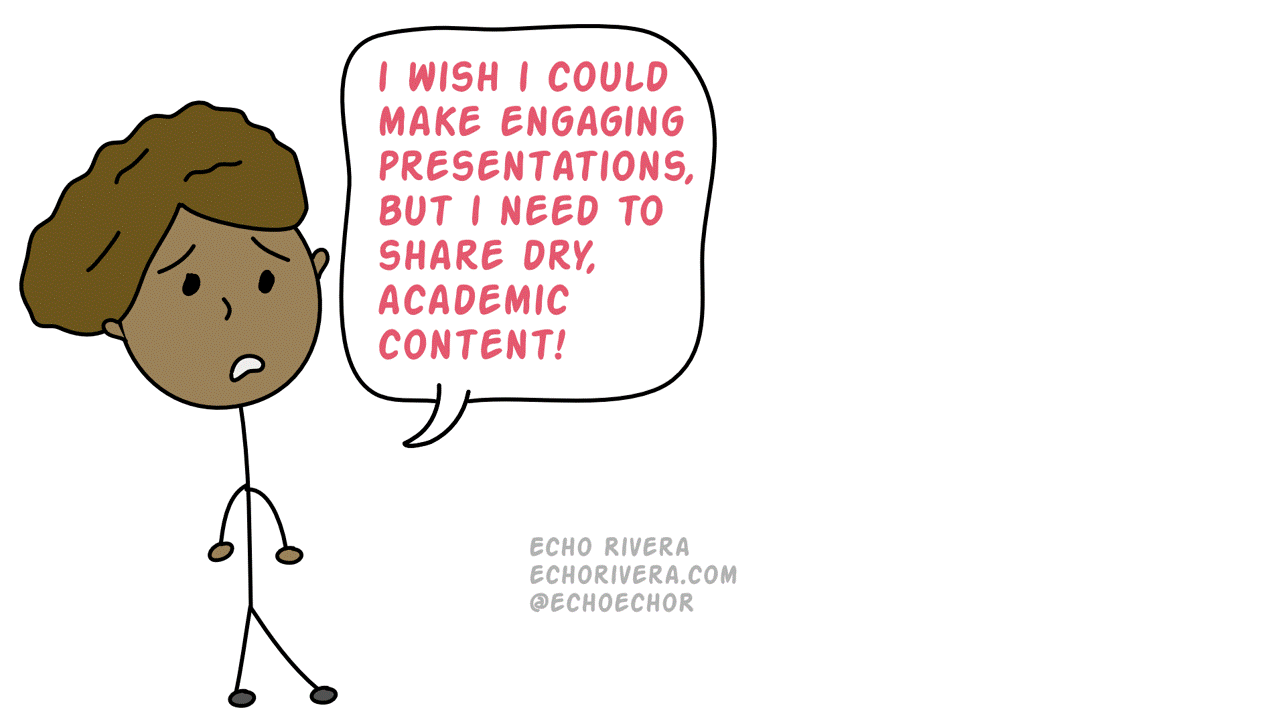
A lot of people come to my training worried that I’m going to tell them they have to choose between sharing dry content and creating a visually engaging presentation. When clients are considering hiring me to do a professional development training for them, this is one of the first concerns they share. And then I can visibly see the weight lift off their shoulders when I reassure them that these are not mutually exclusive. That I, in fact, specialize in helping folks take dry content and use design + storyboarding (and other strategies) to make it engaging.
The reason you think it’s impossible is because of how you’re currently presenting information. Walls of text, using as few slides as possible, and the traditional formulas we’ve all been taught (e.g., intro/method/results/discussion) have shut down the part of our brain that is a natural storyteller.
It takes some time to unlearn that, and you need to unlearn that before you have that insight-moment of seeing where the narrative fits in. You have to unlearn the standard academic delivery before you can see there IS a way to share dry, educational, data-heavy content with a strong narrative.
Narrative building for your presentation takes a lot of practice to get right, which is why I help people fall into it rather than start with it. In my experience, trying to get you from wall-of-text slides to narrative building is like throwing you into the deep end before you’ve learned how to swim. Even for those who make it back to shore, it’ll still be a horrible experience.
In my training we start with unlearning all the bad habits and ineffective ways of presenting information you’ve been taught. That’s the easiest way to start—learn a bunch of things to just stop doing (it saves you time!). Then we build slide design and presentation organization skills on top of that. That’s the easy next step—learning graphic, information, and data visualization design. And then you start to add in your narrative, which is the hardest step if you start here. BUT, when you’ve already made it past the first two steps then this feels achievable.
(2) Presentations that are just lectures (i.e., minimal audience engagement)
I’m hearing a lot of people say they don’t know how to engage their audience in a virtual format. To be fair, this can be challenging and audience engagement (e.g., discussions, active learning) can sometimes be a lot easier when in person.
But I have to pause and ask—did this person actually engage with their audience when presenting in person? Because, looking back at all the in-person presentations I’ve experienced (courses, conference presentations, workshops), a gigantic chunk of those involved ZERO audience engagement. In my experience, this is a problem of all presentations and not just webinars.
So, again, I have to wonder…how many people struggling with this now also struggled with doing this in-person, too? And, again, is it just that we are now finally realizing just how important audience engagement is and that we (the collective we) need to improve that aspect from the ground up.
It’s not everyone, it’s not 100%. I know that some people totally rocked their in-person audience engagement and are now truly unsure about how to translate that to an online environment.
Hopefully you’re enjoying this blog post so far. If so, you’ll love my free training.
(3) Presentations that take forever to create (and still don’t look great)
Do you feel like you’re spending a lot of time on your slides, but they still never look the way you want?
This is really, really common and whenever I have the chance to ask questions and dive deeper into what’s happening, the insight is always the same: they’re wasting a ton of time on things that don’t help their presentation (or make it look worse!), working on their slides manually when they should be automating some of it, and not spending enough time on the tasks that make huge improvements in their slide design.
For example, maybe you’ve found that it takes forever to find the right visuals for your presentations. I’d be willing to bet it’s because your very first step is wrong and sets you up to fail. Instead of working on your slide and then looking for the perfect visual for that slide, you should be looking at pictures first and then thinking about how that picture can be used later on.

What?!
I know. Totally different than what you’re used to and I explain it in this video about how to create your visual database.
Want another example of how you might be wasting a ton of time?
Do you know how to customize PowerPoint Master Slides so that you can create well-designed slides easily and quickly? If the answer is no then I can guarantee you’re wasting time. Professionals use Master Slides. It’s how we can pump out fabulous looking slides quickly, spending significantly less time than folks who aren’t using their own customized Master Slides. It’s such a critical skill that my course members get a 90-minute training on how to become a pro at this, because it’s the #1 way to headbutt the concern “I don’t have the time to create visual slides” right in the face.

One more example: Do you specifically and strategically create presentations in a way where you can reuse, recycle, and build on your existing slides? If no, then you’re probably wasting a ton of time. One common example of this is choosing a new slide template each time you present the material. That’s going to make you waste time later, guaranteed. Another example is looking for new visuals every time you present something new instead of seeing how you can re-use the great images you already have. The approach I take is that each time I create a new slide, I’m trying to invest my time in it. It sounds super corporate and gross to say that, but honestly it helps me save time. I try to think about how the visual I use and/or the design I use can be used again later on (for YEARS, even). If you’re constantly “reinventing the wheel” and designing from scratch, you’re wasting a ton of time.

And ultimately, the more time you waste, the less time you’re spending on strategies that will make your presentation stellar. This ends up feeling discouraging, and creates a negative feedback loop when trying to work on your presentations. You can sense you’re wasting time, so spending a lot of time on presentations feels like a waste of time. You’ll be stuck here until you can build more efficient systems when working on your slides.
(4) Having unrealistic expectations about the time it takes to create an engaging presentation
The previous point is really important, but I don’t want to give the impression that creating a stellar presentation is a fast activity. It’s not.
Let me ask you this.
Imagine your co-PI saunters into your office and says: “Ok we need to get our study published ASAP, but we need to spend as little time on it as possible. Let’s try to write it in an hour.”
I imagine your response would be a mix of horror and surprise. “Surely, they know that a quality manuscript takes time and effort, and it doesn’t make sense to set an arbitrary limit on how long it’s going to take?!” you’d ask yourself.

You can replace manuscript with grant proposal and it still applies. We both know you’ve spent a T-O-N of time on manuscripts and grant proposals, and yet I’m willing to bet that you never once felt like you were spending “too much time” on it.
But WHY do you know this?
Because you already know that if you want to have a well-organized, coherent, concise, and impactful piece of communication then it takes time to get it right. And that amount of time cannot be arbitrarily determined in advance.
So why is it that as soon as this piece of communication changes from a written format to a visual + verbal format, we suddenly expect it to take “as little time as possible?”
I still haven’t figured this out, tbh. I don’t fully understand the cognitive processes here, so I’ll just conclude that humans are weird. 🤷♀️
So that’s why I needed to burst your bubble, because it doesn’t work that way. If you want to have a stellar presentation then it takes time to do it. Period. It doesn’t take forever, and it takes waaaaay less time than a manuscript or grant proposal (unless it’s a job talk or something wildly high stakes). So, that’s the good news.
But if you want to create a visually engaging presentation that actually encourages your audience to pay attention, understand, remember, and use the information…then the whole mindset of “I need to spend as little time as possible on this” must wither away and die like that neglected succulent in your office.
The key point here is that your goal is to prevent wasting time (see previous) and maximizing your efficiency. The goal is NOT to set an arbitrary time limit for how long you will spend on it.
And let’s be honest. The main reason we want to be able to create a presentation in “as little time as possible” is because we’re procrastinating. If you don’t even start your presentation until 1 week before the talk, then the first bad habit to break is that. I recommend you start working on a presentation about 6-8 weeks before you deliver it. Don’t freak out. It IS possible, and after you try it a few times and realize how much less stressful it is (and how much better your slides are) you’ll wonder why you ever waited until the plane ride to the conference. Learn about my recommended presentation design timeframe and workflow here.
The goal is to spend as much time as you need to (a) meet your presentation goals for THAT presentation, and (b) create a clear, concise, and captivating presentation, and (c) waste literally zero time while doing so.
(5) Presentations that follow both good and bad advice found online
This is going to hurt, but hopping on social media and asking #SciComm or #AcademicChatter or your academic FB group or whatever for their “best presentation tips” is a really bad idea.
This is another one that I struggle to understand. We all seem to agree that presentations we watch, on average, are terrible. We all feel #DeathByPowerpoint when we watch a presentation. So why, then, would you ask those same people for presentation advice? Humans are weird. 🤷♀️
I see it ALL. THE. TIME (and am often tagged into them). And, without fail, literally every single time it’s a mix of good advice, neutral advice, and terrible-omg-please-don’t-do-it advice. For example, the most common response people share? “Use as few slides as possible” or “Only use 1 slide per minute.”
GAH!
That is THE WORST advice for presentations. The worst. If you follow that advice, you are not creating an effective or engaging presentation. Guaranteed. It’s such a kiss of a death that it’s one of the first things that people in my courses unlearn.

But humans are wired to assume that if a piece of advice gets repeated over and over again then it must be true. For example: A Dyson vacuum. Everrrryyyyone said how great it was. Evvveerrryyyyone said it would be MAGIC. So we got one and it was a waste of money and I’m still angry about it (#TeamShark). (see also: why I regret buying a Yeti).
OK. Where was I…
Right. Bad presentation advice. The whole “use as few slides as possible” isn’t even the only piece of bad advice out there (I’m looking at you, power pose). But that’s not even the worst part. The worst part is that there are some good tips sprinkled in, which has the effect of making all tips shared in that thread seem helpful. You’ll have no way of separating the good advice vs. bad advice.
That’s why I recommend you stop crowdsourcing for “tips and tricks” about creating good presentations. Take professional development instead and think about what a great opportunity that is for you. Imagine what can happen if YOU can break free from this ineffective learning strategy and learn how to create engaging presentations the right way. While everyone else is creating ineffective slides based on crowdsourced “tips and tricks” and bad advice passed down from social media generation to social media generation, you’ll stand out with a visually engaging, effective presentation that people actually enjoy listening to.
(6) Hyper-focusing on just one element of presentation skills (e.g., data visualization) instead of comprehensive presentation skills
Data visualization is the hot topic right now, it has been for years. It is absolutely a skill you should learn and it is absolutely part of what makes an effective academic, scientific, or educational presentation.
But it’s not the only thing. It’s just one piece of it.
I recommend against hyper-focusing on one element of presentation skills, especially if it’s dataviz. Why? Because you can have the most beautiful and engaging graphs that tell a powerful story all you want, but at the end of the day if the rest of your presentation is ineffective then people will have disengaged before you even get to those gorgeous graphs you spent hours on.
I have seen presentations where it was obvious the presenter spent a lot of time and investment in their dataviz skills and not other presentation skills. Maybe the graphs looked great, but then it was slapped onto a slide with a default template which significantly waters down the impact it could have made. Or maybe, the opening was so boring and standard (e.g., here’s a 10 minute bio of me + extensive “thank you’s” to my team) that I wasn’t even that interested in the rest of the presentation and only paid half attention to it. Or maybe the opening was still a list of learning objectives (oh, noo). Or maybe the bubble people and clip art throughout was so outdated and distracting that it was actually jarring to see a well-designed designed graph, which made it seem like they hired a dataviz expert to do their graph for them but then didn’t hire them to help with the entire deck.
None of those are good. If you want a stellar presentation, then it needs to be consistently and reliably stellar from start to finish. This is why when clients come to me for slide design services, I do not do individual slides. I overhaul the entire presentation, from start to finish, so it has a consistent level of design on all slides. Similarly, when looking for professional development, you should prioritize a course that teaches you comprehensive presentation skills. You can always do deeper dives built on individual aspects later, but you need a solid foundation to get that consistent look across all slides.
Next steps to create an engaging virtual presentation for your talks and lectures
You just learned 6 reasons that presentations are ineffective and #DeathByPowerPoint that had nothing to do with PowerPoint itself nor the delivery format. These are not the ONLY 6 reasons, this is by no means an exhaustive list. What I hope I’ve demonstrated to you is that being an effective presenter is a lot more than just having PowerPoint skills and it’s a lot more than learning a few quick “slide design tips and tricks and hacks.”
Yes, there are some unique aspects of virtual presentations that can go wrong, such as bad audio or lack of video editing. But even the best microphone (which is not the Yeti) and even the most snazzy video editing won’t make up for any of the above issues. The above 6 issues must be addressed if you want to have an effective and engaging presentation. The technical aspects come later.
Hopefully this is not a discouraging message to hear. In fact, I hope this helps you understand why you’ve been on the presentation struggle bus for so long. Hopefully this helps you understand WHY your presentations don’t seem to be improving the way you want, making the type of impact you want, and/or making you feel like you’re wasting a lot of time. More importantly, I hope that I’ve shown you there is a way to learn what you need. Learn more about effective presentation skills and my training system in my free online course.
with joy,
Echo Rivera PhD
Links shared in this post >>