✨
✨
You can captivate any audience, with any topic, with creative & engaging presentations.
I’ll show you how with just these
4 focused trainings…
Accessible & modern presentations
Visually engaging slides from scratch
Data storytelling & design (quant & qual)
Captivating content & storyboarding
…which include these handy
4 implementation tools.


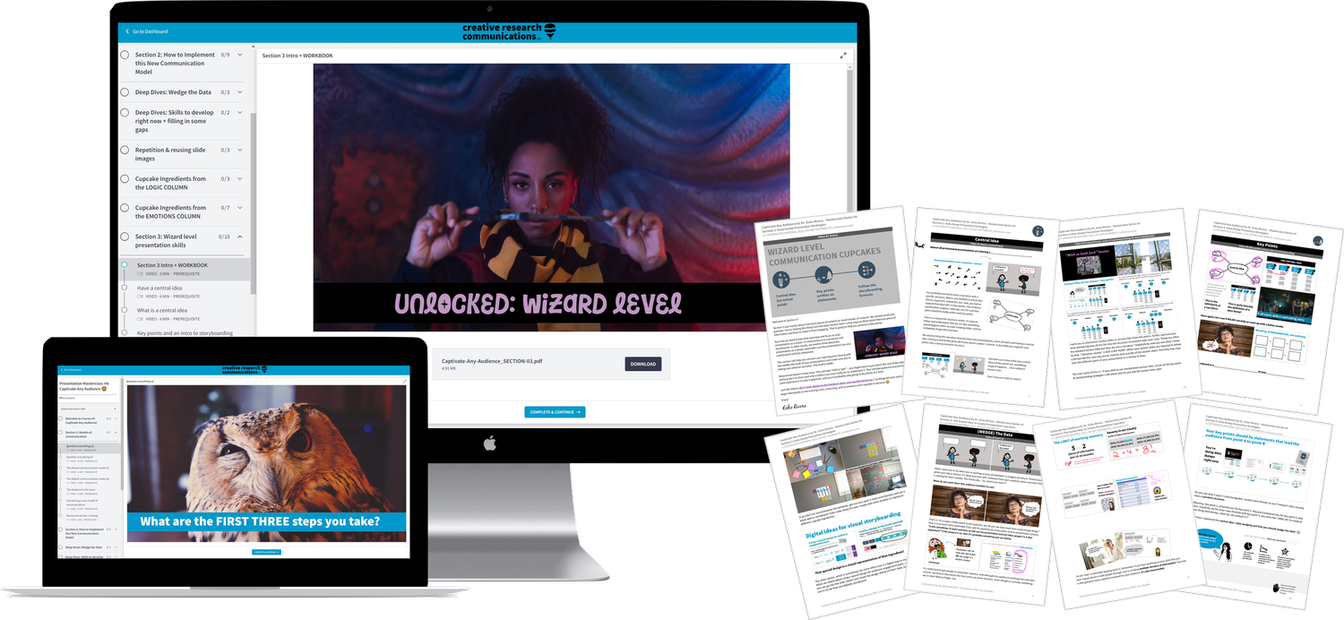
MASTERCLASSWEBSITE NAVIGATION
Let’s talk about what you’ll be able to do after each course.

Everyone is taught to info vomit to their audience and lecture them to death ☠️.
So if you want to change minds, transform communities, and make a difference with your work…
a new model of communication is needed.
I explain everything in this one video.
Or keep scrolling for more details about each course and how it’s going to level up your skills to defeat clutter, chaos, and data dumps!
It’s 💯 totally possible for you to turn those overwhelming “data dumps” into visually powerful presentations.

Yes, even if YOU:
are an introvert
are an extrovert
are nervous and have public speaking anxiety
dread working on or giving presentations
have dry content or educational, data-heavy presentations
are busy and can’t take forever to design slides.
“suck at design” and aren’t a “visual thinker”
present in-person, as a recorded video, AND/OR as live webinars
Yes, even if your AUDIENCE includes:
distracted students with the attention span of a potato 🥔
grumpy academics who fight to keep #DeathByPowerpoint alive in their own lectures
data people who want to see all the data
“non-technical” people who don’t need all that data
the community or “lay” audiences who have zero tolerance for mid lectures 🙅♀️
people with physical, learning, or mental disabilities/difficulties
policymakers, civil servants, state/federal/govt staff where politics or bureaucracy can get in the way of evidence-based decision making
Yes, even if your MATERIAL is:
Entirely data-based or data-heavy
Qualitative data
Traditionally considered a “dry” topic
Is an emotionally charged or difficult topic for people to hear
Something that doesn’t lend itself to visuals easily (hard to visualize)
OK.
With that out of the way, let’s address one more decision that might be giving you pause….

DIY my own professional development & training?
Take a professional development course?
Hire someone to design my important presentations?
Well, I learned this DIY, so I know it’s possible.
It started in childhood (lol, yes really.) As a level 10 introvert who hated socializing, I was constantly reading fiction. Like seriously: I read nonstop. I’d finish a book, and start a new one that same day. I was completely obsessed with stories.

I also have a long history of creating random things. I have drawn comics, made videos, wrote stories, made radio shows on cassettes (which would be called podcasts today), painted, made newsletters, done cross stitch, and lots of little crafty things. All helped me hone my design, art, and patience skills.


What you’ll need to do is essentially learn these interdisciplinary skills. 👉

That interdisciplinary skillset is how you end clutter, chaos, and data dumps (and, therefore, cognitive overload) AND appropriately blend data, logic (plain language) and emotional impact.
And here’s how I gained that skillset.
And then, I got a BA, MA, and PhD in psychology. And my PhD is in community psychology, which means which means I worked with non-academics a lot. I had to communicate effectively to both researchers and non-researchers. Also, I didn’t do a clinical track, I focused on research, which was my entry into data design.
You’re probably wondering how that adds up to the interdisciplinary skillset needed for presentation design…
Yup. That question is exactly why DIY is so freaking hard and time consuming.
The answer comes down to 2 things:
(2) But it was my creative hobby:
After years of getting compliments, I finally started to truly enjoy the process and realized it was a creative outlet for me.
I could (still can!) easily spend 4-8 hours sitting on my chair, putting together a presentation and experimenting with new ways to communicate my ideas.
It was pretty easy for me to do things like reverse engineer what made a good story or good design in something, and then apply it to my presentations.
And then later, my degree in psychology helped put the final pieces together.
👆 those are the top 2 reasons most people give up trying to DIY this. It takes way too long and/or it’s too hard to put the pieces together.
😱 I eventually realized that I was kind of an oddball for being SO obsessed with reverse engineering storytelling secrets and design practices & spending 8-hour sessions playing around with PowerPoint.
⚡️ That’s the moment I understood exactly why so many presentations were dull, confusing, overwhelming, and underwhelming…
🙌…and when I realized that the way I could help was by taking my DECADES of DIY and (literally) 10,000 hours of experimentation & practice…
🎁…bundling it up…
🌈 and turning it into an easy-peasy (fun & engaging) 32-hour learning pack for you.
🦸♀️ Because if I have a superpower, then that’s what it is! Making this EASY FOR YOU.
Obviously, there are a lot more resources around to help you with learning design, storytelling, and software.
But that’s not going to save you the time you think it will. Here are the books I recommend, as these helped me learn new things or confirmed that what I figured out on my own was correct:

Even the above pack of books won’t truly cover everything. Even across all of these books, there are some pieces missing. And no single book covers everything you need to know to fix your presentation from start to finish. So, the above stack is like the minimum you’d need PLUS the additional DIY approach of lots of experimentation.
When I wasn’t reading, you’d probably find me playing a video game. I was super lucky: we had DOS computer when I was young, and I had a gameboy too. I loved how interactive and engaging video games were.

And by the time I was in high school, I was interested in web design and graphic. I built my first site using Dreamweaver, and created my own visuals (banners, etc) using Photoshop. From there, I continued to teach myself how to use all kinds of different design & creative software.
(1) It took FOR-FREAKING-EVER!
I spent what most people consider to be an excessive amount of time on my presentations.
I’m talking 10-20 hours for a 5 minute class presentation.
I hated public speaking and this started as my way to cope.
But I also understood from an early age that good stories take time.
I had zero problems and zero regrets with spend 5-10 hours exploring an idea, even if I scrapped it and never used it.

Or, I’d be completely enamored during TV shows and movies. I loved them because they were visual stories. Seeing different visual effects or the way design & visuals were used kept me captivated.

So, yeah.
DIY is a grueling grind with no guarantee that you’ll even reach your communication skills goals.
Meanwhile…
Taking a professional development course will keep you sane & your wallet happy (relatively speaking), while guaranteeing that you’ll meet your communication skills goals.


You can always make your money back, but you’ll NEVER get your time back.
The DIY approach is an attempt to trade your time in the hopes of saving some money, right?
Maybe this time, instead, choose to invest some money, outsource, and preserve more of your time.
(especially because, for this specific thing, the DIY approach usually costs more money AND more time in the long run anyway!)
But you don’t need to outsource it all. Slide design services are prohibitively expensive for most people.
But that’s because requires a unique, specialized set of interdisciplinary skills for someone to do this (especially when you have data).
Like, you’re not going to get that when you hire a graphic designer. They only know one narrow set of skills, and will not help you storyboard and make your content easier to understand. In many cases, they’ll make your content more confusing and less accessible, with some fancy designs splattered on top.
To hire someone who can learn your material enough to help you present it more effectively? Uh, yeah. not cheap. I charge $5-10k to design ONE 1-hour talk from scratch (assuming you already have a workable, complete, script). And, look… it’s worth every penny: I help clients create change, get jobs, sell their books, and sell their courses/services.
Plus, a pretty standard speaking fee starts at $5k-$10k…just FYI in case you didn’t know that.
But it’s also not realistic for most people to go that route. And I don’t even think it’s best option for most people. I actually encourage most design clients to at least work with me instead of just hire me to do it all.
Outsource the training path to me. Learn this once, quickly, and with zero wasted time. Then go forth and create an infinite number of powerful, engaging presentations .


This masterclass is the shortcut.
Let’s take a tour of each course that will turn you into a more confident and powerful speaker.


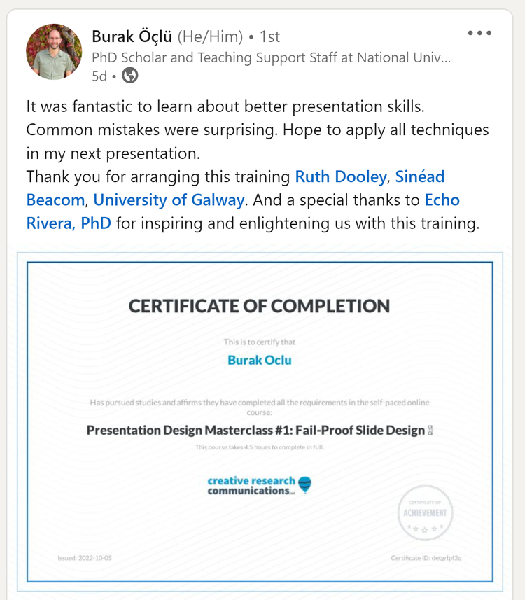
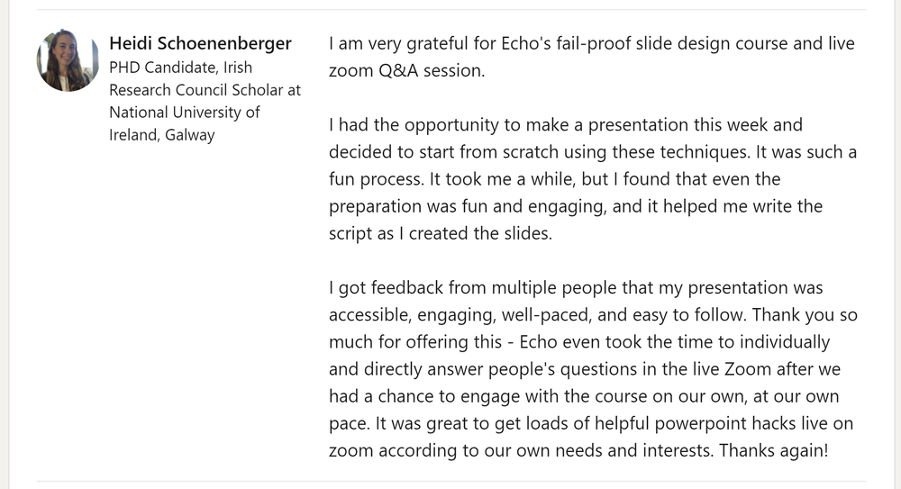
It all starts with course #1:
Fail-Proof Slide Design
From INACCESSIBLE to ACCESSIBLE slides.

Stop me where I go wrong, but right now you’re probably:

Spending a lot of time manually formatting things like font color, font size, and font type.

Wanting to use less text and more visuals, but not sure what layouts to use or how to design photos with text.

Messing about with slide templates (even though they’re inaccessible and violate basic design rules).

Wanting to use less text, but worried you’ll forget what you wanted to say.

Wanting to use less text and more visuals, but not sure how to find good (free) stock photos.

Limiting how many slides you use in a presentation because you think it’s bad to have a lot of slides.
🤫 p.s. part of this is because you’re completely unaware of the bad habits you’ve picked up over the years, that you’re stuck repeating without even knowing it.
But fear not, friend! This is all about to change because…

After Fail-Proof Slide Design, you will know how to…
Find the perfect image for your slides, super fast.

3 wildly easy layouts for images + text, so you don’t even have to think about it.

Still present slides that are only text (if needed), but use design to make them accessible & actually look nice.

Avoid the #1 element (that all audiences hate) to never have in your presentations EVER AGAIN.

Use the ONE animation that actually helps people follow along with you (and how to automate it when creating slides).

Use the PowerPoint Slide Master to automate the text design formulas (formatting) you learned in this course!

Determine whether you’ve used the correct number of slides in a given presentation.

Which means that you will soon…

Spend less time on all that boring formatting, because you know how to use your slide software to automate most of that.

Have slides that are more accessible than before, which every audience will appreciate!

Be free from those bad habits (like using slide templates or AI designs) that were wasting your time.

Be having a lot more fun searching for free images, because it no longer feels like a slog just to find the “one perfect” photo.

Quickly and easily choose a layout design for slides that will have both text and images.

Have less text on a slide while also being confident that you will not forget what you wanted to say (no memorization required!).
Use the right number of slides in a given presentation.

End that “wall of text” feeling once and for all 🙌

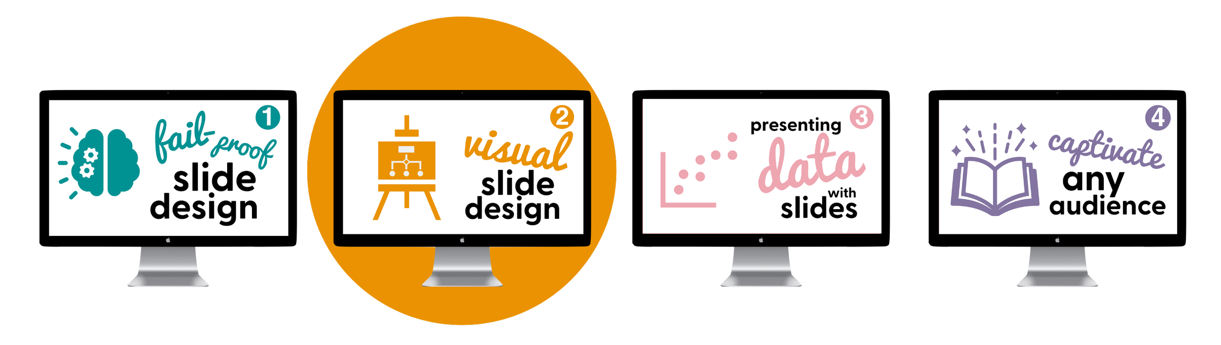

Course #2: Visual Slide Design
From “I’m not a visual thinker” to “OMG! I know exactly how to visualize this!”
Let me guess, right now you are:

Unable to visualize your ideas and avoiding blank slides because you don’t know what to do with all that empty space.

Telling your audience things like “I’m not going to read that to you” as you proceed to talk about stuff not even on your slide (spoiler: that’s inaccessible).

Using slide titles to constantly remind your audience what section of the presentation you’re in (e.g., “introduction, continued” across like 10 slides).

Trying to create your own designs using shapes, text boxes, and icons…but something just doesn’t look right.
Trying to use SmartArt or Design Ideas (or AI design) to present your material in a “more visual way.”
🤫 p.s. part of this is because your creative side has been stifled for years so you’re convinced that you don’t know how to think visually (but I promise, that’s not true!!).
But guess what, my friend? This is all about to change because…

After Visual Slide Design, you will know how to…
Use visual hierarchy (and other graphic design principles) to overcome your discomfort with using blank slides.

Leverage the power of a popular storytelling medium to design your slides—and entire presentation—in engaging ways.
End the inaccessible bad habit of making people read from your slides while you talk about something different than what’s on the slide.

Use simple shapes and text boxes to create custom visuals for almost anything you need: timelines, concept models, statistical models, logic models, visual representations of your concept, etc.

Begin storyboarding your presentation more effectively by adding one simple type of slide to your presentations.

Choose and use icons quickly and effectively, and hack/edit them as needed when they aren’t quite perfect as is.

Use a combination of strategies you learned in this course and course #1 to share quantitative data without even needing a graph.

Which means that you will soon…

Realize blank slides are your favorite places to start, because you know how to visualize your ideas.

Be able to whip together just about any visual you need by using slide software basics like shapes, text boxes, and icons.

Never again have to rely on clunky, goofy, SmartArt or Design Ideas (or AI design).

Align your slides and what you say during the presentation (which makes your presentations even more accessible).

Realize that you do have a creative side, which you can leverage to professionally share information in more visually engaging ways.

Unlock your creative genius!


Course #3: Presenting Data with Slides
From defaults & rainbow graphs to sleek, professional data visualizations.
I see you. Right now you are:

Sharing as much data as possible, because you think that’s what your audience wants (or needs).
Completely stuck on how to share qualitative data in engaging, visual ways (usually because it’s mostly quotes and themes)!
Sharing a massive amount of data in a presentation, because you aren’t sure what point you actually want to make.

Creating “skittle” graphs (rainbow graphs) because you desperately hope that using more color will somehow make your graph easier to understand...or look better (spoiler: it does neither).

Setting up your graphs in the same order as your stats output, without rethinking the order you present the data in.

Putting all your data in one graph and then spending forever talking people through that one graph because you think that’s how you’re supposed to share complicated data (spoiler: it’s not).
🤫 p.s. Part of this is because you’re trying to share too much data all at once and no one has taught you how to storyboard your data.
You know what I’m going to say next. This is all about to change because…

After Presenting Data with Slides, you will know how to…
Avoid the most common mistakes researchers make when sharing and designing their data (quant and qual).
Why you should never present basic quant data as a table (e.g., demographics table), and what to do instead.
How to design quantitative data, such as pie charts, waffle charts, icon arrays, line graphs, bar charts, and stacked bar charts (Likert scales).

How to design qualitative data, such as Venn diagrams, participant quotes, speedometers/gauge charts.

Implement data storyboarding foundations by learning how to present with clarity.
How to use animations to tell powerful, mind-blowing data stories.

Which means that you will soon…

Feel totally confident that you’re sharing data in a professional, sleek way (which boosts your confidence overall).
Realize simple graphs that are designed & storyboarded well are often the perfect data visualizations (for quant and qual), and that you don’t actually need to use Tableau or anything fancy.

Know how to figure out your key message before you even start working on your graph, so your audience can leave the presentation with a solid understanding of the data you presented.
Be able to share only the data you need to, in that moment, so that your audience is never overwhelmed by your dataviz.
Know how to design quantitative and qualitative data, so your presentation design is balanced across all data visualizations.

Use sleek design principles to highlight the key point you need to make, in that moment, which makes it super easy for your audience to stay with you and only focus on the part of your dataviz that you need them to focus on.
Use advanced design strategies and animations to make your data come alive and blow your audience’s mind because of how engaging your data visualizations were (even though you didn’t even use Tableau 😉).

Tell powerful data stories (quant & qual)


Course #4: Captivate Any Audience
From DATA DUMPS to CAPTIVATING presentations that make a lasting, positive IMPACT on every audience.
(Deep breath). Right now you are:
Revising your presentation over and over and over again, and exhausted from the process.

Unknowingly giving your audience mental “whiplash” because of the order you choose to present your information in.
Beginning your presentations with learning objectives, the agenda, logistics, and/or speaker bios.

Unintentionally spewing “data dumps” at your audience, because that’s what you’ve been taught to do.

Ending your presentations with a generic “thank you” or “questions?” slide that just has your contact info.

Constantly facing “writer’s block” (aka “speaker’s block”) because you don’t know what you should include.

Constantly frustrated because you always seem to create talks that are too long at first, but you don’t know what to cut—everything seems so important!

Unsure how to tailor your presentation to different audiences, especially when it’s a “non-technical” or “non-research” audience.

Nervous because you’re presenting about evidence-based policies, diversity, equity, inclusion, and social justice and your audience is defensive or hostile to that.
🤫 p.s. Part of this is because you start your presentation prep by asking “what do I want my audience to know” and/or because you’re still using written outlines to plan your content. Both of those make your life harder!
Ok, let’s do this one last time. This is all about to change because…

After Captivate Any Audience, you will know how to…
Use the storyboarding formula to make ANYTHING engaging for ANY AUDIENCE.
Avoid the current default model of communication that is tragically ineffective.
Apply a new model of communication is both fun and simple to use (and, of course, more effective).
Understand the psychology of your audience and share your info in more relatable ways.
Confidently decide what to include in your presentation AND what to leave out of your presentation.

Use storyboarding strategies to choose a clear and coherent order for your presentation.
Craft an opening hook that, within the first 30 seconds, convinces them to watch from start to finish (and that leverages current evidence about the primacy/recency effect).

Stop ending on a whisper, and end with a strong call to action (even for class lectures!) that leverages current evidence about the primacy/recency effect.

Appropriately deal with (or prepare for) audiences that might be resistant, hostile, or defensive (particularly relevant for people who talk about diversity, social justice, inclusion, and equity)
Which means that you will soon…
Feel more joy when working on your slides, and way less frustration. (Warning: you may be caught laughing at your own jokes or gleefully cheering at the creative way you just figured to present that “dry” content!).
Create a better first draft of your presentation, which will cut down on how much time you spend revising it (or, at least, stop that feeling you’re just spinning your wheels).
Create such a captivating presentation, that your audience might even forget social media exists.

Be able to tailor your presentation to different audiences, with minimal revisions and no overhaul needed.

Witness the moment, in real time, that you just changed someone’s mind or made them think of something in a new way.

Build trust and connect with your audience in ways that you never thought was possible (which pays off in dividends when you need to get through dry or complicated material).

Suddenly want to do a TED/TEDx talk, because you’ve realized that you have an idea worth sharing AND you now have the skills to get up on that stage and share it like a boss.
Vanquish data dumps (info overload) once and for all!


Being a skilled presenter (AKA visual communicator) feeds 2 birds with 1 scone. 🐦🍪🦜
How’s that?
Having a creative outlet and knowing that your work is meaningful are 2 key ways to prevent burnout.
Few things are more professionally creative than a visually engaging presentation + you’ll literally see the difference you’re making in real-time among your audience.
It’s one of the few burnout prevention strategies that you actually have control over!
Here’s what happens when you develop these highly valuable presentation skills:
Be a researcher who excites people about your work and moves your field forward.
Create presentations with less stress and more efficiency!
Be a professor whose lectures captivate and inspire students!
Have more fun at your job, impress your boss, and become an invaluable powerhouse at work!
Be a speaker who can move hearts, change minds, and make people take action!
Have confidence in your slides, your info, and most importantly—confidence in yourself.

To sum it up: we’re talking LESS anxiety, MORE confidence.
AKA stop being held back and actually enjoy giving presentations for once.
It’s time to vanquish imposter syndrome. 😤

🤩 ENROLL NOW 🤩
This Presentation Skills Masterclass Training Bundle includes6 or 12 months’ access to:
Course #1: Fail-Proof Slide Design
Course #2: Visual Slide Design
Course #3: Presenting Data with Slides
Course #4: Captivate Any Audience
The Visual Database Add-on
The custom PowerPoint Template
Access to updates made while enrolled
Access to join the zoom sessions
Share your knowledge and exciting research WITHOUT FEAR.


This is the year that you master creating presentations that matter—a skill that will never go out of style. 😎
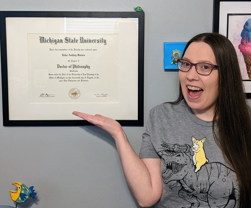
Hey there 👋🏻! I’m Dr. Echo Rivera.
I’ll never forget the time I sat down, excited, to watch a new webinar from a well-respected scholar in my field….only to be so bored within the first 5 minutes that I stopped watching.
I wasn’t even mad at the speaker, but in that moment my heart broke. 💔
Why? Let me give you the backstory ~
I earned my PhD (Community Psychology) in 2014 and then worked at a nonprofit research & evaluation center for 3 years. In all, I spent over 14 years dedicated to research and evaluation.
My research focus was on (ending) gender-based violence using intersectional, community-based approaches. While fulfilling, I realized we had a major problem. All systems of oppression are fully connected, yet many social justice researchers & practitioners are heavily siloed.
Even worse, literally everyone had the exact same struggle 😩—their presentations were dry, boring, confusing, overwhelming, or underwhelming.
I became massively overwhelmed and frustrated that all these brilliant people, doing important work that could literally reduce systemic oppression, were effectively whispering into the void of their own silo.
I grew increasingly anxious that we wouldn’t see major positive social change in my lifetime. I’m not even kidding when I say it started to keep me up at night.
But it was in those sleepless nights that an idea started to form. 🌜✨
I didn’t realize it at the time, but starting in undergrad I began learning a secret weapon. Born out of my intense fear of public speaking, I poured excessive amounts of energy into my class presentations. I started to hear things like, “That was the best presentation ever” and “Damn, I wish our professor lectured like that!”
That turned into conference presentations, evaluation finding presentations to the client, and other high stakes professional presentations. I continued to hear “That was the best presentation ever” and “You’re the first academic I’ve ever understood, you make this technical stuff sound so easy.”
While I was seeing head nods and captivated audiences, my colleagues were seeing blank eyes staring into space.
While I was hearing, “you changed my mind today, thank you!” my colleagues were hearing crickets.
Finally, one night it all clicked together.
I realized, I can’t personally make all the different fields of research collaborate and break down their siloes. But, what I could do is take what I’ve learned over the years and help make everyone a powerful speaker. 💪
And so I decided to center my work around one goal: To skyrocket the number of powerful speakers who use data to make the world a better place. 🚀
My mission is to make sure no respected scholar ever bored people again.
And so Creative Research Communications—my professional development company—was founded.
That’s why I’m here, creating these online courses to help YOU create better presentations. Because, for me, it’s my small part in creating a better world through better communication.
I can’t wait to help you become a powerful speaker! 🙌
with joy,
Echo Rivera, PhD