[COMIC] Be like the Wilson's Bird of Paradise: Use contrast to your advantage
The lesson in today's post is simple: If you want to design effective slides, think like a bird.
But not just any bird: The Wilson's Bird of Paradise.
I was watching Planet Earth II (OMG, right? Such a cool series!) and there was a short segment on this bird. The male bird has some mating strategies that are exactly the type of strategies I want you to apply when you're creating your presentation slides.
Please keep in mind that I'm not a scientist who studies birds, so this is a highly simplified summary :)
OK, so Wilson's Bird of Paradise is a species that lives in the rainforest. When the male wants to find a lady friend, it looks for a spot that has a tiny tree sticking up from the ground.
psst...this blog includes illustrations I made. Want me to make some for you? Email me at echo@echorivera.com! Oh, and these are copyrighted. You can share this post widely, but if you want to use these, email me first!
The only problem is that there's too much clutter around the tree. This will become important later, so the bird gets to work. He clears up--or declutters--the area surrounding the tree.
Once the area surrounding the tree is completely free of leaves and other colorful plants, he sings a song begging a female bird to come check out his performance.
Once she arrives, she hops onto the tree and looks downward at him. My non-scientific, likely inaccurate interpretation of this is that she instinctually knows that this fool better prove he's worth her time before she lets down her guard. Smart lady. He gets that, he's a feminist, and starts to prove his worth by doing some fancy bird dances.
THEN. And here's the best part: During the dance, he opens his mouth or does some other weird bird thing ... and then all of a sudden...
(Yes, I need to get better at shadows and perspectives. Whatever, I did my best).
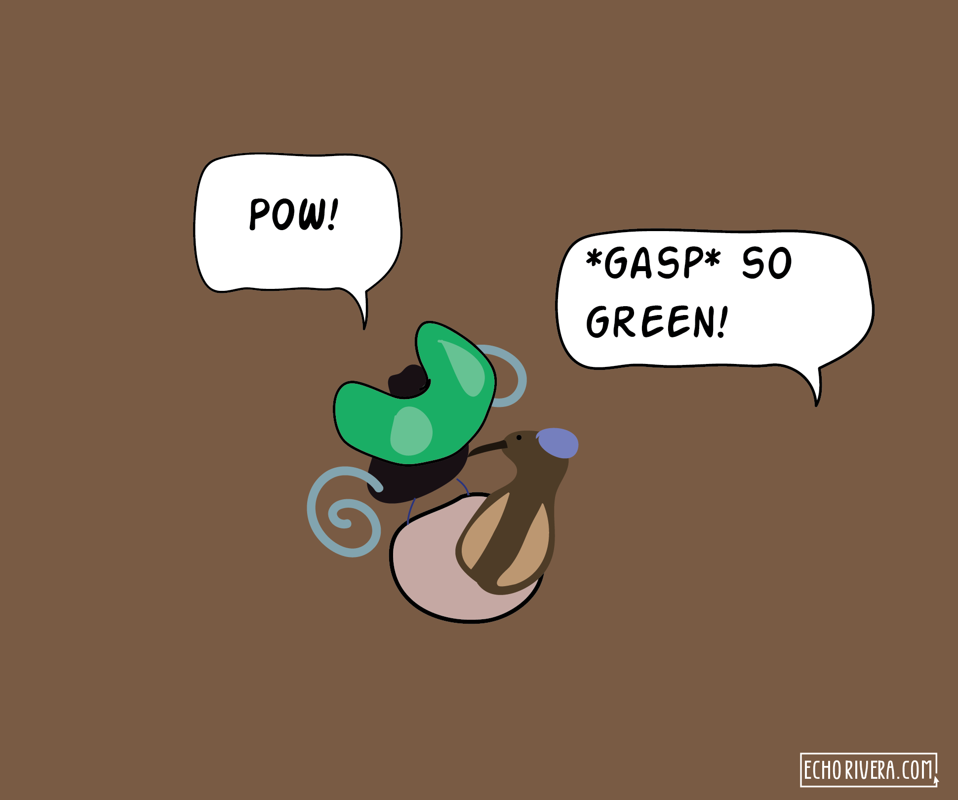
POW! Now lady bird is looking down at this bright emerald bird fluff. And because (a) he carefully removed all other leaves, and (b) because she's staring down at him, the emerald contrasts brightly against the dull brown backdrop.
If he hadn't bothered to declutter first, his emerald bird fluff wouldn't be nearly as impressive.
If a bird understands contrast and uses it to win a mate, I'm pretty sure you can learn how to use it to impress your audience.
Let's start over. Pretend you're the bird and you want to impress your peers at that upcoming conference. After you've finalized what you're going to say (because you followed my presentation workflow), you must spend some time on the design of your slides. I recommend you start with decluttering, just like the Wilson's Bird of Paradise.
Look for anything that doesn't need to be there. That's what you want to get rid of.
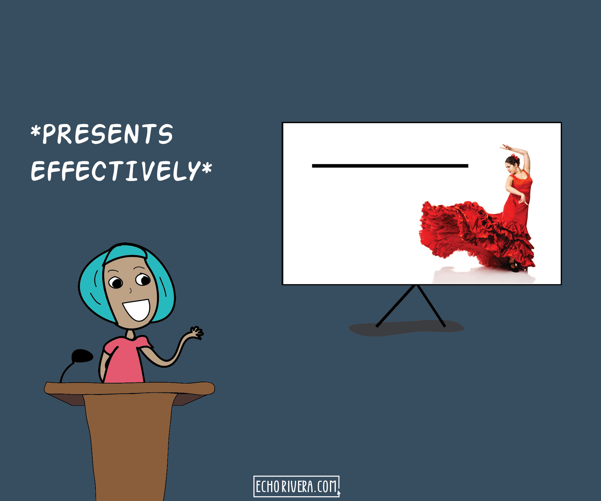
And after your presentation has been decluttered (among other things, of course), you can now give your presentation performance and impress your peers, colleagues, students, etc. Remember, though, the Wilson's bird didn't just declutter. He also did fancy dances. Watch my video here to learn more about how you can make your presentation a professional performance.
All the time and energy you spent decluttering and adding focus to your slides will help your audience more easily understand and remember what you say.
And because of all the effort you put in, they'll be more likely to still be paying attention when you get to your key points--the information you want to be the most "sticky."
Good thing you put in the effort to declutter and deliver an effective presentation, because if you left your slides full of clutter then you wouldn't have made an impact!
Want to learn how to declutter your presentation slides?
I have FREE training I think you'll love! Sign up below to get started.
Thanks for reading!
with joy,
Dr. Echo Rivera


