[VIDEO + BLOG] How to use similarity & proximity to design stellar slides - GESTALT SERIES #3
Before you read this post >>
This is actually a written version of my YouTube video. Watch the video here >>
Show Notes & Screenshots
This is video #3 in my series about how to use Gestalt psychology in our presentation design. In the last video, we talked about the principle of simplicity, and then used it to simplify a cluttered and messy slide.
But, notice a problem with this slide? If every slide looked like this, you'd put your audience to sleep! So, even though it's better than when we started, it still needs some design help.
But where should we start? Let me ask my research assistant, Sage, what he thinks.
Ah, good point! Everything on the slide looks the same, so we'll start with the principle of similarity. And now that I’m thinking of it, it’s kind of cramped too -- which makes me think of the proximity principle. Let me explain what those are and then show you how to use those principles to make this slide better.
Proximity & Similarity 101
The principle of proximity states that elements close together are viewed as one unit. Elements that aren’t close together are seen as separate.
Kinda like when you’re with that really weird and awkward friend and then you see someone cool, so you pretend like you aren’t with that friend by physically distancing yourself (psst... that's not very nice, btw).
The principle of similarity states that things which share visual characteristics such as shape, size, color, texture, value or orientation will be seen as belonging together.
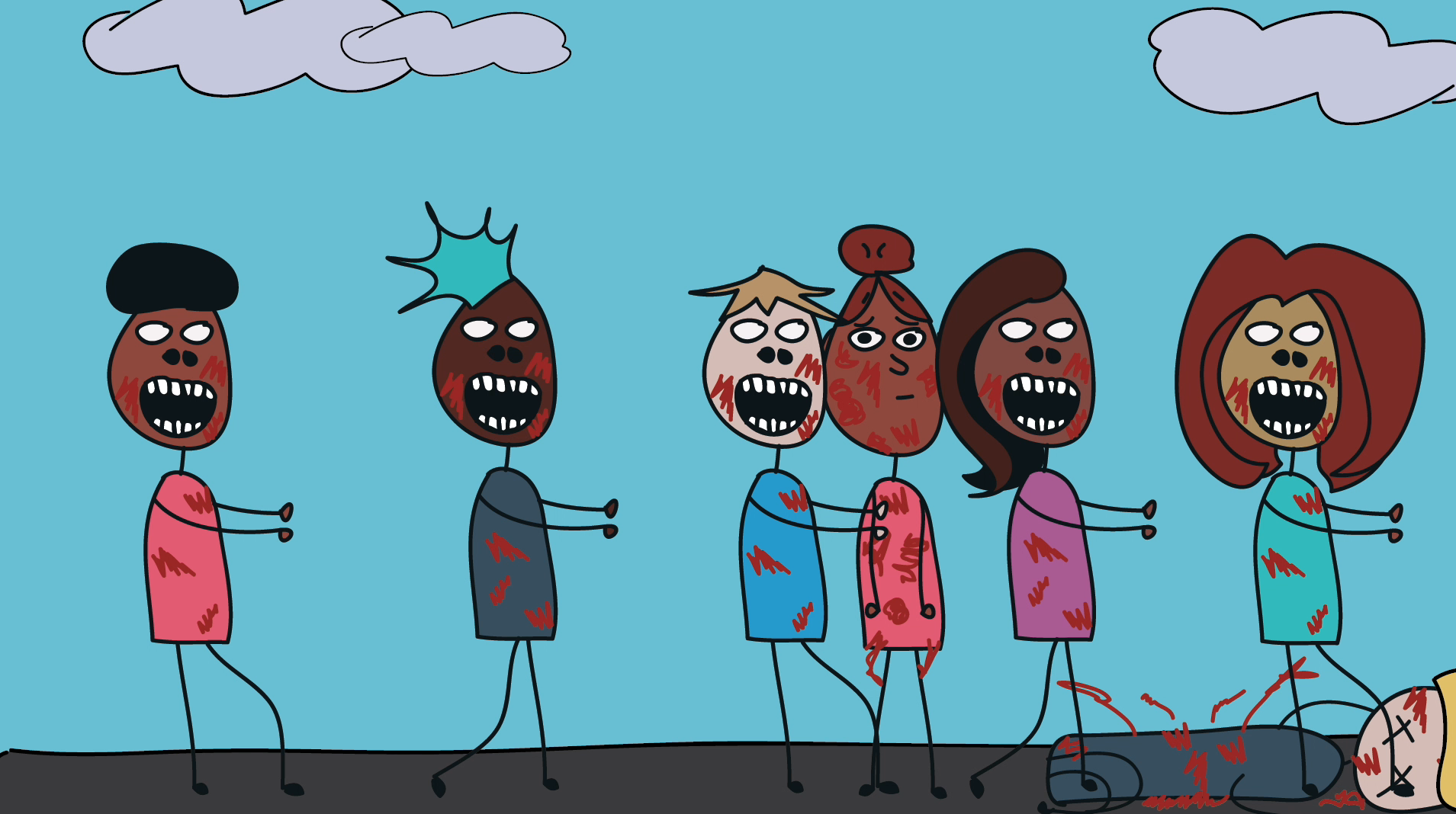
Kinda like how in every zombie movie people don’t get eaten by the horde because they cover themselves in zombie slime. They make themselves similar.
Still not sure what I mean? Here, let me hop over to PowerPoint to show you.
Let’s first talk about proximity, which again basically means stuff that’s close together will look like it belongs together. For example. What do you see here?
A bunch of random shapes on the slide, right? You probably aren’t really sure what you’re looking at, and if I asked you to count the number of shapes, you’d probably be annoyed with me. So, tell me what you see now:
You might still see a bunch of shapes…but I’m willing to bet that you also see a square, that happens to be made up of shapes. It's all the same shapes, sizes, and color. All I did was bring the shapes together, I made them close to each other. And remember from the first video: our brain likes to see the outline before the individual parts. so your brain right now is most likely trying to see the square, instead of 16 individual shapes.
Now let's see what happens if I add some more space:
Now you probably see 4 columns of shapes, because the shapes within each column are now closer to each other than the shapes in the other columns.
So the key here is that if you want to make things on your slide part of the same group, then make them close to each other. On the flip side, if you want to tell your audience that the elements aren’t in the same group, then add some space in between them
Now let’s talk about similarity. Again, this is basically stuff that LOOKS the same, has the same design features, and looks as though they’re part of the same group.
Let’s go back to this slide here. Thanks to proximity, we’re more likely to see a square than 16 individual shapes. Right? But, let’s be real. Our brain has to do some extra work to get it because of all the different colors. It is still distracting.
But if it made everything the same color, well, now all of a sudden it becomes a little easier to see this as a square doesn’t it. So we can use similar colors to to make the audience perceive that these are all part of the same group. We can also use similar shapes to do this.
I will make them all the exact same shape, now it’s even easier to see this as one cohesive group, and as a square of circles.
Now we can use both similarity and proximity together to make people see what we want. Let’s say I want you to see 4 columns instead of a square, or 4 smaller groups, then I just have to adjust the distance between objects to create those visual perceptions.
Ok. Now let's say I want you to see 4 groups, without changing the proximity. This is where color can help.
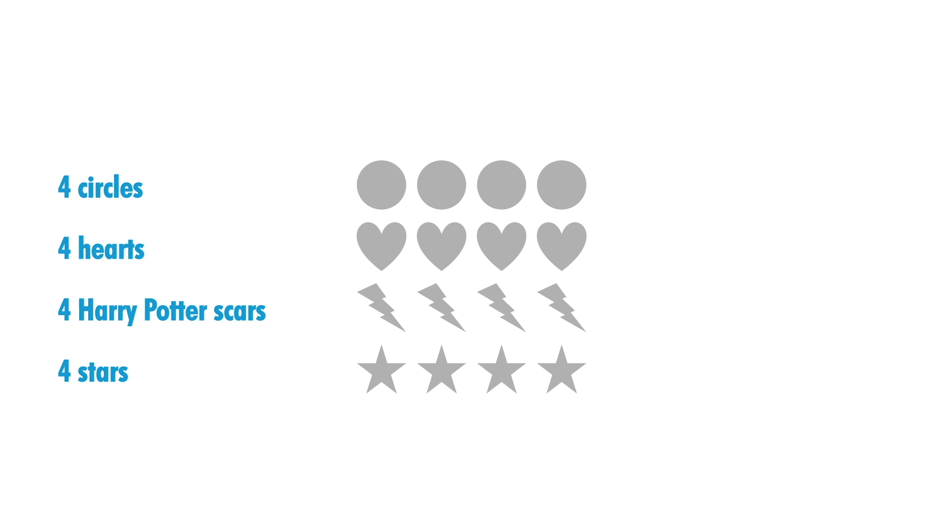
Now you probably now see 4 rows, or 2 rows of blue circles and 2 rows of gray circles. So just adding some color turned this square into rows without adjusting the proximity at all. I can also use size to make you see different rows (or groups), and I can use different shapes to make you see 4 different rows. Using multiple strategies all at once makes it even easier to tell what belongs together
Let's keep going with this, and add color back in.
What do you see first, or the easiest: 4 columns or 4 rows? My guess is that the 4 columns is either the first or easiest for you to see. That's because, right now, color is the most meaningful. Right now, your brain is using color first to organize this information.
This only becomes stronger if we add in another layer, like proximity (4 columns), and then even stronger than that if we make each color grouping the same shape (4 rows).
Hopefully now you're getting the core message: You can use multiple proximity and similarity strategies to make it excruciatingly clear to your audience what information belongs together and what information is different from each other.
If you want to show your audience that objects belong together, keep them close and use the same color, shape, size, etc.
If you want to show your audience that objects are in different groups, keep them apart and use different colors, shapes, sizes, and etc.
This is all still abstract, so I think you’re ready to learn how this applies to slide design. Let’s talk about what belongs together and what should be distinct.
Congratulations! You now know the basics of proximity and similarity. Now. It’s time to apply this new information to our slide.
How to apply these principles to slide design: The Makeover
Now it's time do the makeover on our slide. This template already made the heading and body text each a different color and size, so that's good.
However... these are different enough. The font sizes are (a) too small and (b) too close together. So, we need to make everything bigger -- and the different sizes more obvious. So, that helps...but there's still another problem. The same typeface is used for both the heading and the body text. So I'm going to make them two different typefaces (Arial Black for the heading, Century Gothic for the body).
Almost there! There's just one more issue with this slide. Each point for the body text has almost too much proximity. They're so close to each other that it feels like a wall of text. So we need to adjust the distance between each point so there's a little more breathing room. That "goldilocks" zone where it's still obvious that all 4 points are the body text, but not so close together that it feels like ONE giant point (i.e., like a wall of text).
Hopefully you are already seeing the benefits of using visual perception research to design better slides. Let's take a look at the before and after for this series.
Thanks for reading!
If you enjoyed this blog post, you’ll love my FREE training.
with joy,
Echo Rivera, PhD


