[LIES SERIES] Lies you've been told about effective presenting (part 1: the facts)
Hey, friend. You’ve been lied to and that makes me VERY unhappy.
So in this series, I need to talk about the things that you’ve been told over and over again about how to create effective presentations (using PowerPoint, Keynote, Google slides, etc) that are actually lies.
But first, make sure you grab this free download for today’s post….
Ok. So I know that you believe some harmful myths about effective presentation design for an academic, scientific, professional, or technical topic. You believe these myths because you’ve been lied to, so I’m here to set a few records straight.
Before I explain the lies…let me briefly explain why people lie in the context of giving presentation advice.
…Is it because they’re bad, evil, horrible people? No.
…Is it because they secretly want you to fail at presenting? No, I really doubt it.
Okay. We’ve got that out of the way. I don’t want anyone reading this and trying to say I’m calling people evil or bad for saying these things. Because I’m not.
So, why would people lie to you then? What’s the reason you’re getting so much bad presentation advice?
In some cases, admitting that these things are lies means you have to admit that your own slide-based presentations need to get better. That you have to admit you need to put effort into changing the way you present.
If you have two choices: (a) say things like: “walls of text are necessary and professional” OR (b) spend the time to edit your entire slide deck, removing the excess text.” Then let’s be honest: option A is the easiest route. It’s not the most effective, but it’s the easiest route.
And sometimes, we like to take the easy route while convincing ourselves that it’s the correct route. That’s just human nature, folks!
So, sometimes, people will tell you a lie, because without even realizing it, they’re just trying to maintain the status quo (option A).
But I believe that, in most cases, it’s simply because they didn’t know it was a lie.
They never received training on how to design an effective presentation. They have used powerpoint for 10 years and thought that was enough. So they are probably just repeating — or parroting — the bad presentation advice that they were told.
And there’s a bunch of lies out there, but I have 5 of them that I need to tell you about.
Like urgently.
Because, if you internalize these lies, then your presentations will never be effective.
This is the first post in the series, so today we’ll be talking about the first lie.
Lie #1: “The Facts”
The first lie is that slide design is an unnecessary bonus.
That it’s nice if you have the time, but at the end of the day, all this design work for your slides isn’t absolutely necessary.
People don’t say it in these exact words all the time. Sometimes people will phrase this lie in other ways, like:
“The facts speak for themselves!”
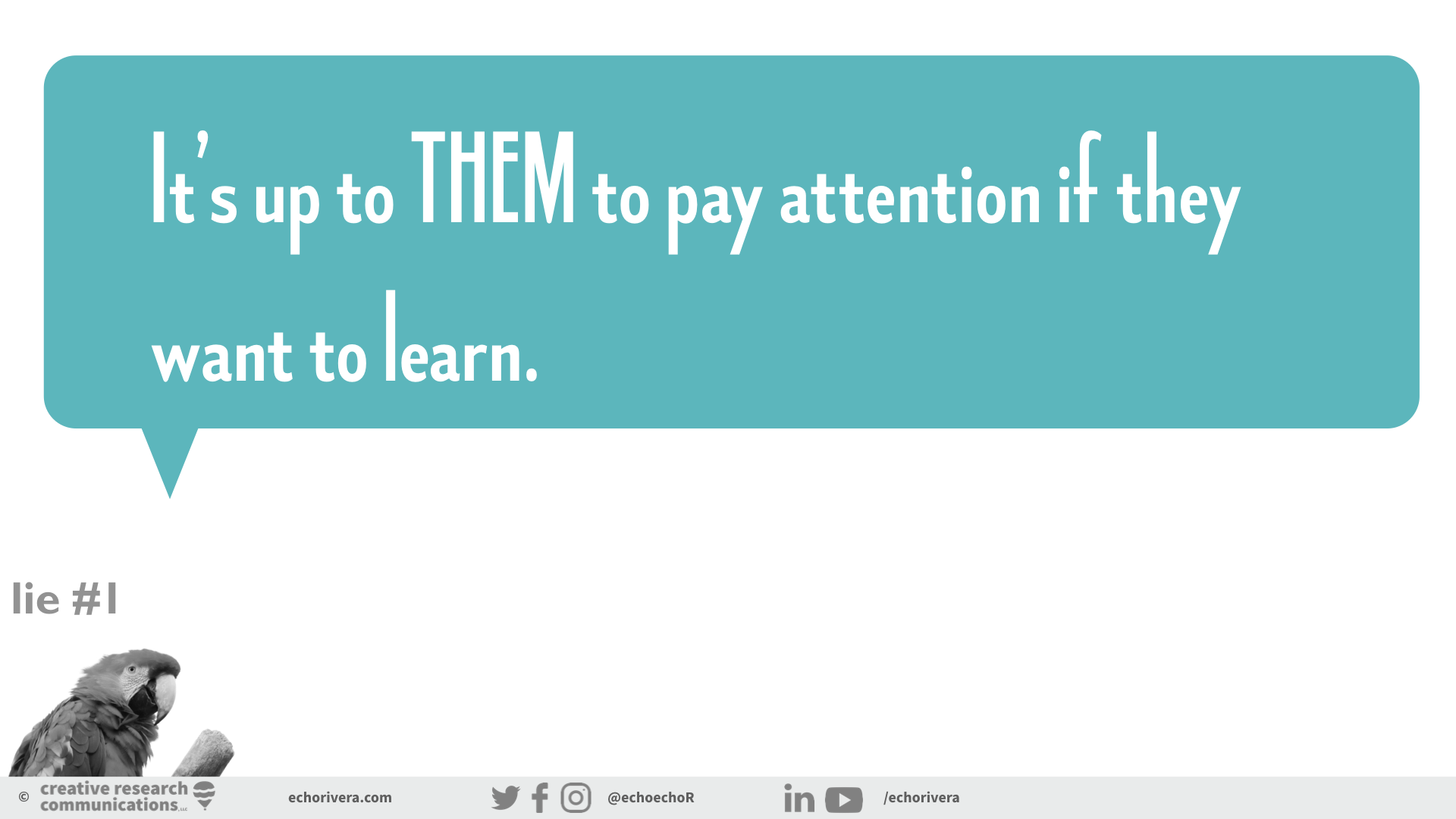
Or, “It’s up to THEM to pay attention if they want to learn. I’m just here to present information and they need to adjust to the way I present if they want to learn it.”
Or, “What’s the point of even making slides all pretty?”
But here’s the thing my friend. All of that …. it’s a lie.
Let’s break it down for a second. In order to believe this lie, you also have to believe that no matter what your presentation is like, your audience (students, peers, colleagues, clients, etc) will still be able to pay attention and learn.
That the scale of learning is from neutral to loving it. And the slides with no design (i.e., bad design) create a NEUTRAL experience. And the slides with ALL THE DESIGN create the “loving it” experience for your audience.
But that’s not how it works. If you have poorly designed slides, or an ineffective presentation, then it’s NOT a neutral learning experience. You’re DECREASING the likelihood that your audience will pay attention to you, understand you, and use the information later.
In other words, “neutral learning” actually belongs more in the middle. And when you have no design (i.e., bad design) then you have an INEFFECTIVE presentation.
And by the way, I’m using the term “design” a bit loosely here because that’s the term people use. But just so you know, I’m actually talking about all of this: Information design, graphic design, data design, and storyboarding. Really it’s a whole framework and not just about “pretty slides.”
If you aren’t designing your slides using a comprehensive framework, then your slides are ineffective.
So the bottom line is this.
People might tell you that it’s not important to have well-designed slides, but it’s not true. The unchecked assumption, the underlying message that they’re actually sending is actually “It’s not my responsibility to do everything I can to help my audience stay engaged and learn the material.”
Which, just so you know, is not supported by the evidence. Which is why it’s a lie.
As the presenter, it is your responsibility to do what you can to make learning as enjoyable and easy as possible.
…and well-designed slides are a critical part of that.
So now you know the first lie: That “the facts speak for themselves,” or that “design doesn’t really matter all that much.” Hopefully, you’re really interested in the other 4 lies! Stay tuned for future posts to learn what they are!
In the meantime, if you’re interested in learning more and investing in your presentation skills…I have several options for you!
If you’re looking for some presentation training & coaching, I have:
professional development / training webinars (for individuals and groups)
group mentoring,
online courses,
and individual training sessions
If you’re looking for some custom slide design work, I also do that!
Contact me for more details.
But that’s all for now. Don’t forget to grab this free download. It includes a refresher on what we talked about in this post AND some extra questions for you to answer to see if you believe other lies you’ve been told.
with joy,
Echo


