A Quick Guide to Make Your Own Presentation Slide Template
A Quick Guide to Make Your Own PowerPoint Slide Template
A long time ago, in a version of PowerPoint that’s much, much older, I used to spend a lot of time trying to find the “perfect” template. Would it be the papyrus-like paper theme or the whimsical dots? Hmm. Tough choice.
Frustrated that none of the default templates really “got me” or captured the tone I wanted to set, I usually settled on the dots.
Then, another grad student came along and literally changed my life.
Watch the video NOW
Update: The download mentioned in this video is no longer available, but I teach this in my masterclass program, and you can kickstart your training for FREE.
“Look at what Emilia (not her real name) did,” my advisor exclaimed. “She made her own template!”
When my advisor swiveled the monitor to face me I was instantly impressed with the clean design and simple shapes “Emilia” used to create her own template.
Then I was jealous.
Then I was angry at myself for not thinking of it sooner.
So, that was pretty much the last time I ever used a default template. “Emilia's” presentation was all the proof I needed that default templates stifled creativity and were cramping my style.
Default templates, I suddenly realized, were the textbook definition of keeping me “inside the box.”
Letting go of default templates was the best decision I ever made. Well. In terms of slide design. The best decision I ever made in life was coffee, but that’s a bit off topic...
Anyway. My current goal in life is to free my fellow researchers, evaluators, academics, and nonprofit advocates from the default template box.
Are you ready to break free?
I can’t heaaaar youuuu!
Ok, I still can’t hear you because this is a blog post so I’m gonna go ahead and assume you’re ready.
Cool? Cool.
The Core Components of Your New Template
The good news is that you only need a few things to create your own template package! It's similar to creating a personal brand for yourself (or the presentation), so it's essentially colors, typefaces/fonts, and consistent.
Here are the core components of a template:
Color palette of 3-5 colors
Coordinated set of 2-4 fonts
Dedicated “style sheet” that details which fonts/colors should be used for what purpose and a commitment to be consistent within the entire presentation (or across the whole project, course, training series, etc)
Core Component 1: Your palette of 3-5 colors
What you need
The default colors in PPT and Keynote are as good as their default templates--as in, they aren’t good so don’t use them. It’s time to find your own custom colors.
I tend to use 2 main colors in my presentations:
1 color for the headings
1 for the body text
Then I have a third color for special things, like a callout or emphasis. For example, maybe I’ll use a speech bubble on slides with qualitative DataViz (e.g., quotes).
That’s pretty much it. Plus I use black and/or gray as my neutrals so my slide deck doesn’t look like a circus.
How to find matching colors
Look. I need to admit something. I have a really hard time matching colors.
Like, my partner has to help me get dressed sometimes because I've been known to mix some horrible colors together.
If you're at all like me, then I have some good news to share. There's a whole bunch of people who like to create color palettes and just put them online for people. Isn't that great for people like us?
When you find a color you like, write down the HEX and RGB code (PPT in Windows uses RBG and PPT in Mac uses RGB or HEX). If you only have one and need the other, there are color converters online.
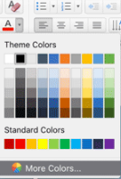
Use that to manually change the color in your presentation software (usually under a “more colors” type of option in the color picker). After choosing "more colors", if you don't see the option to change the RGB or HEX right away, choose a different tab until you find it.
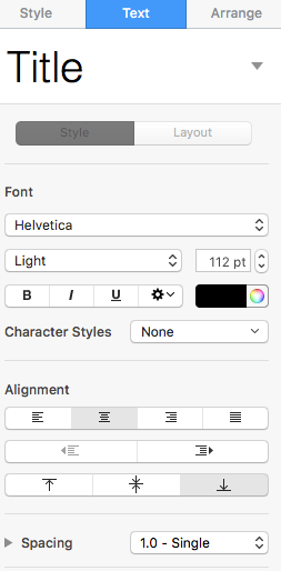
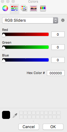
In the images below, I show how to get to the menu that allows you to manually enter the RGB or HEX in PPT and Keynote. The final menu looks the same for both PPT and Keynote on a Mac (this is PPT 2016 on a Mac). For the Windows version of PPT, look for where it says "custom" colors...but note that Windows doesn't have a place for you to enter the HEX so you'll need the RGB.
(ppt) Choose "More Colors" so you can manually enter a HEX/RGB
(keynote) Click on the color circle so you can manually enter a HEX/RBG
Then change the tab on top so it's on the slider. Change the dropdown menu to RGB slider if needed.
Where I find my color palettes:
Dribbble.com > Graphic designers showcase their work and share their palettes. Great way to find new colors, especially ones that match. I'll usually find 1-2 colors I like on here, then go to the Adobe Color Wheel to find 1-2 more that match.
Cinema Palettes > A twitter account that creates color palettes based on popular movies.
Adobe Color Wheel > You might want to bookmark this one. You can upload an image to pull colors from it. And, like I said earlier, if you find one color you like, you can use Adobe’s Color Wheel to type in the HEX or RGB to find its complementary colors. Warning: it’s easy to lose track of time using this thing!
My own photos > I've also used my own photos to find colors I like. You just need to:
Drag/drop a photo into PowerPoint or Keynote
Create a shape (I like using circles for this) & click on the menus so you can change the shape fill. Choose More Colors, but this time click on that eyedropper (shown in the images above).
Using the eyedropper tool, click on the color you want to pull from the photo.
The shape is now that color, and that color is saved in your color options.
Color apps > There are (of course) apps that can pull colors from a picture on your phone or generate color palettes. I haven't used this type of app in a while, so I don't have one to recommend, but I at least wanted to mention this option in case it sounds like something you might want.
Core Component 2: Your 2-4 typefaces (or fonts)
What you need
Some people have said to only use 1 font per slide and I strongly disagree with this. Using 2 fonts is a great way to establish contrast and hierarchy between headings and body text.
Just like with colors, I tend to use 2 main fonts in my presentations:
1 font for the headings
1 for the body text
Then I have 1-2 more fonts for special things, like to emphasize a certain part of a quote or main point. These should be used rarely, often only a couple of words at a time.
The special font can be a script (handwriting-like) font, but all the rest should be sans serif fonts or slab fonts. Don’t use a serif font in your slides. Serif fonts are harder to see on large surfaces (like a screen) compared to sans/slab serif fonts. The “little feet” (what serif means) fade in and out and look distorted.
Examples of serif typefaces:
Times New Roman
Baskerville
Bell MT
Georgia
Examples of sans serif typefaces:
Calibri
Arial
Verdana
Century Gothic
Wait? Two typefaces, or two fonts? Which is it?
Excellent question. So, we often use this interchangeably even though they're different things. I honestly don't care if people use "font" when they should say "typeface." I'll know what you mean.
But, to explain this part I do need to use the terms properly. So, a typeface is the name that you use to describe what font you're using: Arial, Century Gothic, Georgia, and so on. The font is how you've styled that particular typeface, so: Arial Bolded Size 20.
I tend to use two different typefaces when I can (each styled in a specific way, of course). But, when it comes to your presentation, you could use 2 different fonts instead and get the same effect.
In other words, for your 2 main fonts you could use:
[2 typefaces] Verdana and Century Gothic (in whatever color or size you chose for each) or
[1 typeface, 2 fonts] Century Gothic (bold, large size, color A) and Century Gothic (regular, smaller size, color B)
Want an example? READ THIS AWESOME POST, The secret to great typography (It's really not about the fonts you chose) by Lilach Manheim.
A note about custom typefaces/fonts
Now it’s time to decide whether you want to use the default fonts or download new ones.
I like downloading fonts, but it’s sometimes a pain when I try to edit a presentation on a different computer that doesn’t have the font. I use PowerPoint and Keynote on Windows and Macs, both at work and at home. So yeah, this can get a little chaotic for me sometimes.
I’ve heard you can embed fonts in a Windows PowerPoint file, but I’ve never tried it. I tend to over prepare for everything, so I will either download the font on every computer or will use a default.
Where to find what you need
Font Pair > helps you find fonts that match. Just remember to avoid serif fonts in your slides
Creative market > you can purchase beautiful fonts or sign up for their newsletter. Every Monday they send out freebies, and there’s usually a great script font you can get for free!
Free font websites > I recommend sticking with commercial use license. Here are two that I like:
fontspace.com > you can filter by license and see preview
1001fonts.com > you can filter by license and see preview
Core Component 3: Create your style sheet
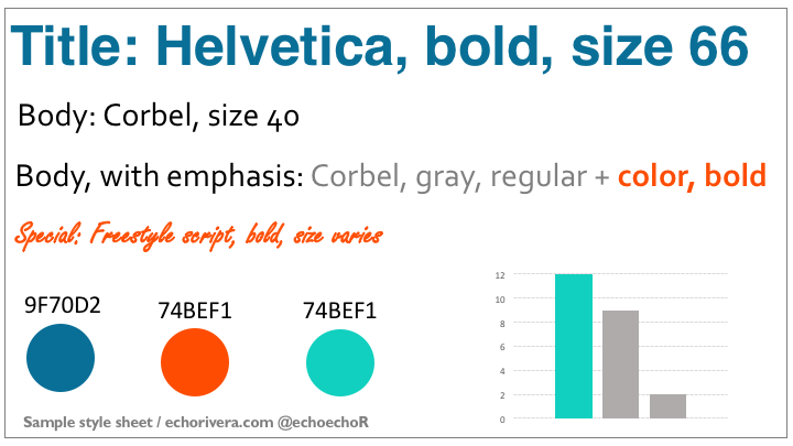
Now it’s time to put it all together in your style sheet, which is basically your own cheat sheet to help you remember which font/colors to use and when.
Here’s an example of what your style sheet could look like:
I do mine in PowerPoint so I can easily copy and paste onto new slides and edit from there. You can also edit the Master Slide template (to some extent) to reflect your style sheet.
Thanks for reading!
Hopefully, you enjoyed this blog post. If so, you’ll love my FREE training.
with joy,
Echo Rivera, PhD


