
Designing a visual report in PowerPoint: a client case study

You probably already know that PowerPoint is what I recommend academics, scientists, evaluators, researchers, and similar professionals use for their presentations. The main reason is that it’s the best for slideshows. The secondary reason is that it’s also great for infographics and report design! Once you learn presentation design skills, especially in PowerPoint, creating great reports and infographics (or other visual documents/social media graphs) becomes MUCH easier.
Here is a screenshot of a report I recently designed using PowerPoint (with a little bit of help from Affinity Designer):

In this post I will show you before and after makeovers for a report I made in PowerPoint, as well as some report design/data visualization tips along the way. This report design project was for a large international non-profit organization and it was a great project to work on!
The report is not quite a slide doc, because it was ultimately meant to be exported as a PDF and shared that way (rather than as a slideshow you read on your own, which is how slide docs are typically used). Still, I hope this provides a helpful example of how PowerPoint can be used for things beyond a presentation.
The client sent an initial draft of the report (the “before” images). I noticed immediately that the team who drafted this was off to a nice start. The font sizes were decent and not too small. There were a decent number of pages already (i.e., the client wasn’t cramming too much info into a single page). They were also using color and shaded text boxes to add visual hierarchy and interesting layouts on each page—something I appreciated. Finally, many of their data visualizations had clutter removed already. In all, this draft was great because it provided a clear picture of how they wanted to organize information and what they were going for.
Designing the Introduction Section
Here’s a quick snapshot of all befores/afters for the intro section.
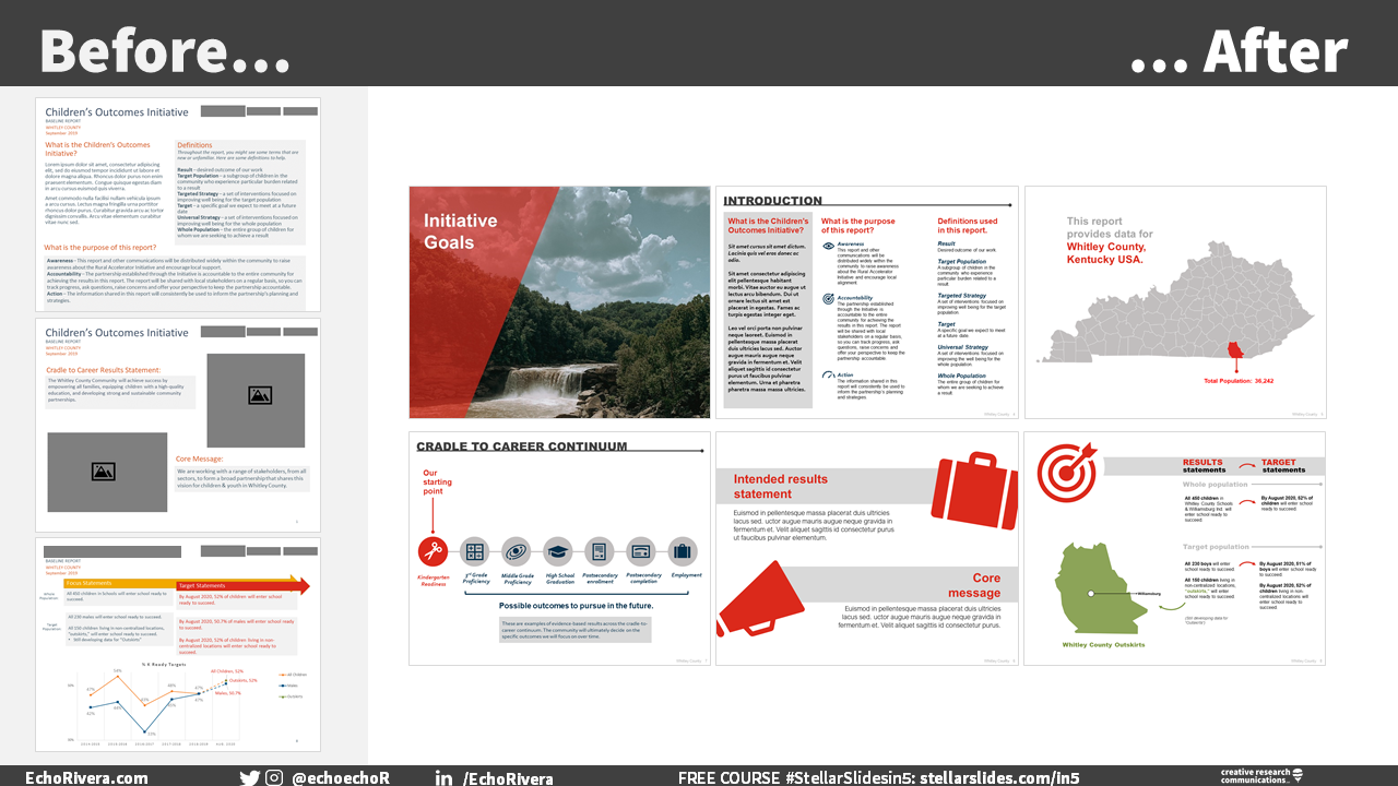
During the project, some new pages were added to the report. For example, I added cover pages to break up each section. Here is a sample of one of those section pages.

AFTER
Here was the first page of the report draft. I’ve blocked out some of the content (logos and photos) to protect client confidentiality.
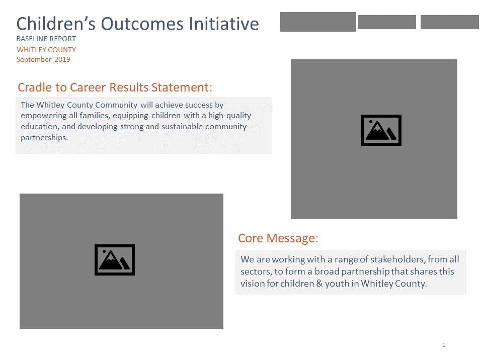
BEFORE

AFTER
I focused on creating a new layout that would visually draw readers in, while also streamlining how easy it was for them to read. This page originally had photos provided by a community member. They were, sadly, too pixelated (low resolution) to use. So, instead, I went with large and bold icons to organize the sections.
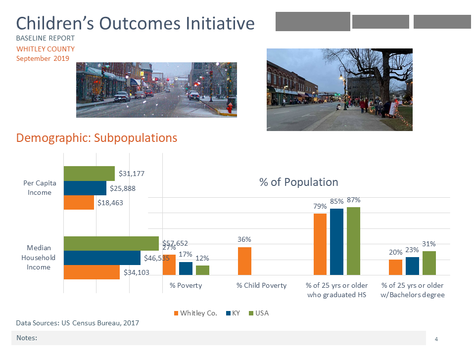
Here is the other page from the report draft. There is a LOT of information in this one page, so this page would need as many information design boosts as I could add.

BEFORE

AFTER
The big changes were I (a) added icons and (b) used a 3-column layout instead of a combined column/row layout. This visually tells the reader exactly what direction to go in (left to right), which will reduce overwhelm when they get to the page.
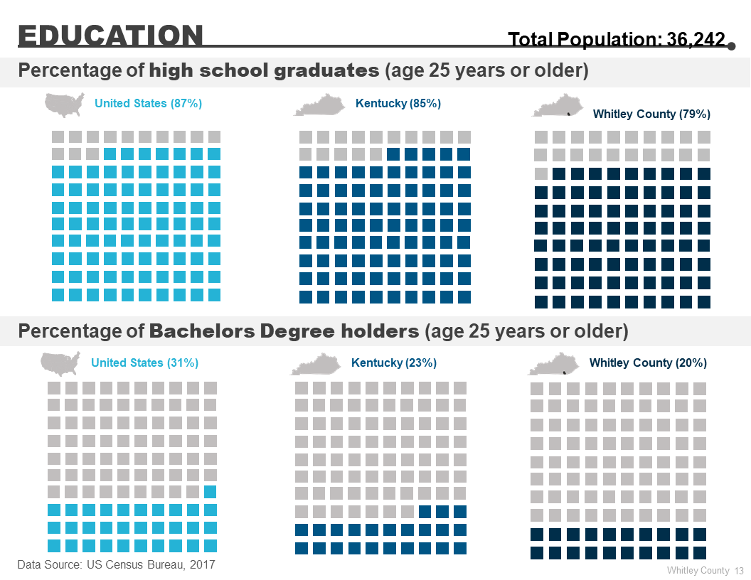
This report provided data for Whitley County, Kentucky USA. The draft showed this information using text located at the top left of most pages, and the population was provided later in the report. While designing this report, I suggested this information could be included in the introduction and created this page. The client agreed and it stayed in the final report.

NEW DESIGN FROM SCRATCH (side note: look how good this looks in a blog post. Designing great slides/reports in PowerPoint means you export those slides as images and they work across multiple settings!)
Curious how we created this? My team purchased vectors of the state (with county lines) and then used Affinity Designer to color in Whitley County. The rest of the design was finished in PowerPoint. With this change, readers now instantly know (a) which County is described in the report, (b) where in Kentucky that county is, and (c) the population of the county. Plus, this was the beginning of an icon theme used later in the data section.
While working on this design, the client had a great idea to add a new page to visually explain the Cradle to Career Continuum, and indicate which of those was the focus of the report. I did this entire design in PowerPoint and I think it added helpful information to the report.

NEW PAGE, DESIGNED FROM SCRATCH
One thing I love about design is that it can often show you gaps in how you’re connecting material or show you that the information could work better with some reorganizing. That’s exactly what happened with this page, which was initially towards the end of the report. However, I noticed that these statements were about setting goals and suggested to move part of it to the introduction section.

BEFORE
The client agreed, so the target statements (top section) were moved to the introduction. I also added a map of the county here. A map of the county and its outskirts was also originally shown later in the report. I love using maps and was glad to see that the draft included one. However, the original map was hard to read (see below), and it was unclear how it connected to the material on that original page. Not a problem! Using Affinity Designer, we pulled the county shape from the image of Kentucky shown above and created a specific color (green) for the “outskirts.” It was now on a page that specifically mentioned Outskirts data.

AFTER + BRAND NEW DESIGN
By moving some of this information to an earlier position in the report, readers now had more background and context for why certain data is shown in the next section. In the first draft, there were graphs with data but without a super clear reason why that data was being shown. Moving this information earlier provided this context.
Data Visualization for Existing Data

Now we’re getting to the fun part—the data visualizations! There was a lot of information provided on each page of this section. To make it easier for readers to process the information, I used more pages (and changed what graphs were used).

BEFORE
Here’s the after. I removed the images so we had more room for the data, and replaced the bar chart with a waffle chart. I added a headline and some shading to separate the two pieces of data. I also changed the donut chart to a table. Overall, this new page has a cleaner feel and will be easier to read and interpret.

AFTER
Okay, next page. This is one where I felt readers might get overwhelmed and distracted with all the different data points. In the original, there were 6 different categories of data, each with up to three locations (United States, Kentucky, Whitley County). Phew! What a challenge! Breaking this information up into more pages was an easy place to start to reduce this potential overwhelm. This one page of data eventually turned into three pages.
BEFORE

AFTER
I took the first two horizontal bar graphs and put them on their own page. I brought in that image from earlier to use as an icon for the Whitley County and the Kentucky data. I then purchased a vector of the (mainland) United States. Using Affinity Designer again, we removed the state/county lines. By adding these icons, it’s now much easier for the audience to grasp the location of each data point. What do you think of the final result?

AFTER
PAUSE! Go back to the first draft and look for the data point on the % of children living in poverty. Notice how it’s buried and really easy to miss? And notice how much it stands out in the final version? That’s the power of design.
Next, I took the first two column graphs and created a page just for those. In the original, the statistic about children’s poverty is really easy to miss—it’s in the middle of lots of other data. In this redesigned version, it has a prominent position on the page and will stand out among all the other data because of the color and size. Notice that the page headings are also changing and matching the data provided.
AFTER
Finally, the last two column charts were placed on a separate page. I used a small multiples approach with waffle charts. After using so many bar charts, I wanted to mix it up and add some variety. I’m still using those map icons to help the reader know the location each category corresponds to.
Design & Data Visualization for Showing Project Goals

The last section of the report was focused on goals and next steps. Overall, the draft was relatively clean and had minimal clutter. However, the information felt a little squished and small, and didn’t stand out. Plus, there was no clear takeaway message for the reader. No problem though, because this is where the map of the Outskirts was initially. Moving it earlier in the report, and off this page, provided more room for this dataviz (yay!).

BEFORE

AFTER
I used small multiples, color coding, and headlines to walk the reader through this data. You may notice that I did not label every single data point for the girls and boys graphs. Instead, I worked with the client on which data points could be highlighted based on the key message. In this case, the key messages were that (a) rates have both increased and decreased over time, and (b) there was a wide gap between boys and girls in the past. This takeaway prepares the reader for the next data visualization. So, we showed the low, high, and midpoint labels for the graphs with boys and girls data. The line still shows the data (it’s not a slope chart), so readers can get a sense of patterns over time. Together with the “total” graph (which shows all time points and each year), the reader has the information needed to understand the key points.
Next, a page was needed to describe the planned activities for improving children’s outcomes. The draft page had three sections based on categories explained earlier in the report. There were icons and shaded areas—all good ideas that I took to the next level.

BEFORE

AFTER
Here is the redesigned version. I chose different icons, added some text design, and changed the bullet points to check marks. A decent amount of white space helps keep each section distinct, and overall this is a clean page that is easy to read.
Finally, a page was needed to showcase targets related to children’s outcomes. In this case, the focus was on three groups: children, boys, and the Outskirts. You may recognize this image, because it’s from earlier in this post. You already saw the makeover for the top portion; now it’s time to redesign that graph.

BEFORE
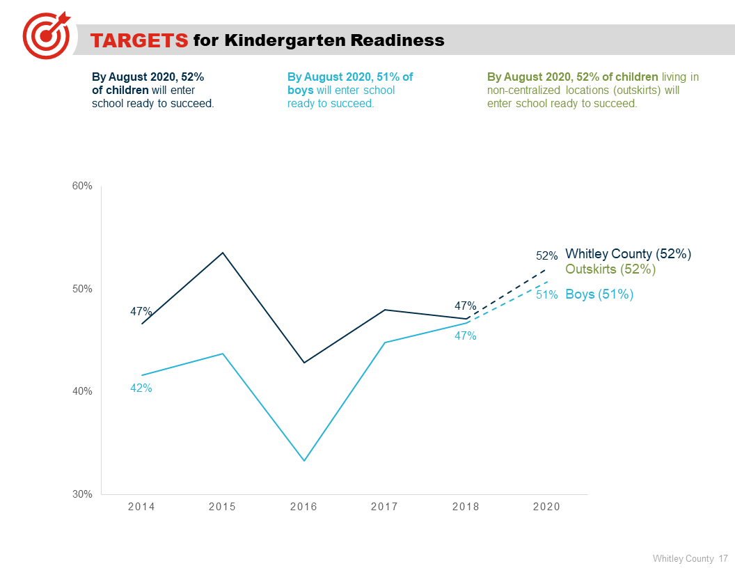
AFTER
I used an entire page for this one graph, and implemented annotations and direct labeling to keep it easy to read and engaging. Again, some of this information was already provided earlier so we didn’t need every single data point. The starting and end point of current data, and projected targets, were the key pieces of data needed for this page.
And that’s it! Hopefully, you enjoyed seeing these before/after makeovers and a behind-the-scenes peek at my report design and data visualization services.
I will say just one more thing: If you’re shocked that we didn’t visualize/label every single data point, and don’t think that would work for your report—that’s okay! Each client/audience is unique and requires a different approach. I will suggest, however, before automatically assuming you need to graph every single data point that you take a moment to challenge that. Have you decided on your takeaway yet? If not, do that first. If so, challenge yourself to remove data points/labels that are not necessary for readers to understand it.
For example, if the goal is to discuss the specific increase/decrease between years (e.g., the difference between 2014 and 2015, then 2015 and 2016, and so on) then this information would be needed. But most of the time, the starting and endpoint are enough. Or, at most, you may also want to show interesting points along the way (mid-years, low years, high years). If you do decide readers need each and every data point, then at least consider alternatives (e.g., a table in the Appendix) before adding them to your graphs. Just remember that showing all data points can mean you lose the forest for the trees, and that your audience will be more likely to get stuck in the weeds. If you need to hang out in the weeds for a little while, great. But if you want people to see the forest, be frugal with how many data points you’re showing.
Thanks for reading!
If you enjoyed this blog post, you’ll love my FREE training!

with joy,
Echo Rivera, PhD