
You. Yes, you. You're using too much text on your presentation slides!

How much text should be on a PowerPoint slide?
Ah. Yes.
My favorite question to answer.
Though, really, this has nothing to do with PowerPoint, per se. The question about when you have too much text on a presentation slide is relevant regardless of which slide software you’re using.
This is exactly the type of question people should be asking, because 99% of the professional presentations out there have way too much text.
That’s just the status quo. We’re all used to seeing slides like this:
But just because we’re used to it, doesn’t make it right.
In fact, having all this text on a slide is highly unprofessional and leads to an ineffective presentation.
How is “ineffective presentation” defined? An ineffective presentation is one that is:
hard to pay attention to
confusing, overwhelming, boring, or underwhelming
forgettable
Oof.
No one wants that.
I know you don’t, because you found your way to this blog post.
And it’s a good thing you did because guess what the biggest cause of ineffective presentation slides is?
You guessed it: too much text.
So how do you know if you have too much text on your slides?
Well, that’s easy…
You do.
I know you do.
It’s one reason we're all suffering from Zoom webinar burnout.
The better question to ask is…how much of an emergency is it for me to cut down the text on my slides?
Because, you see, there are degrees of “too much text” — it’s on a continuum.
Presentations can always be improved, and there is no such thing as a perfect presentation.
So what most of the folks I train need is guidance around whether their slides are in the “it could be better, but it’s okay for now” category … or the “this needs to be fixed NOW” category.
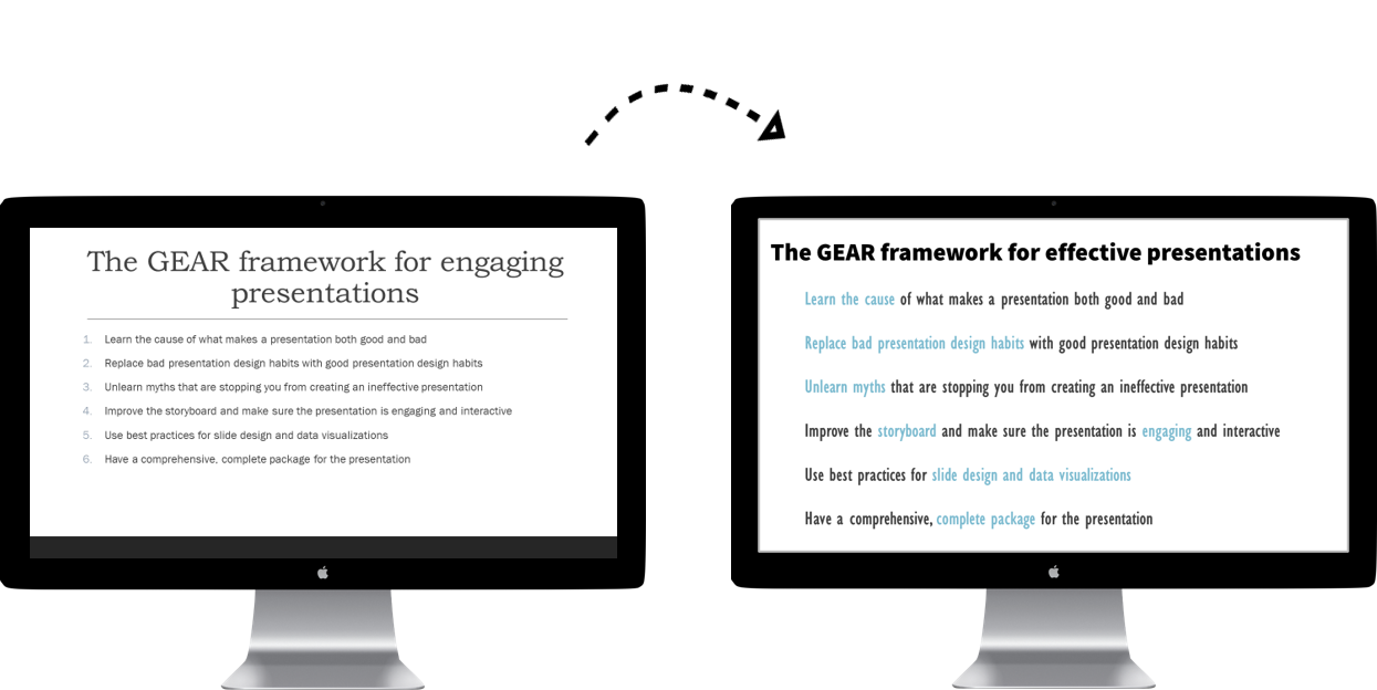
Introducing…the Ban All That Text Scale (BATTS)
The Ban All That Text Scale (BATTS) is a training tool I use in my online courses and workshops.
Online course members learn how to audit their own slides by scoring their slides on this scale:
0 = OMG please end my suffering
1 = Death by powerpoint
2 = Le Sigh, I'm bored
3 = Okay, not bad!
4 = Stellar slide!
…Hey. There’s no need to make learning presentation design skills be boring. I love to make it fun! 😂
So let’s take a look at some examples so you can get a sense of where your slides fall on BATTS, which will help you determine whether you need to fix your slides ASAP or if it can wait.
Before we dig into this topic, I want to let you know about my FREE training. If you’d like to make better presentations than the status quo, be sure to check this out after you finish this post!
Guess the score for this slide…
Answer: 0 (OMG Please End My Suffering)
You probably guessed that correctly, right?
I mean, look at this beast of a slide. 😬
And, no, this isn’t just an easy example I made up to prove a point. This is a real example based on the worst webinar I've ever attended.
This person literally pasted their entire speech--word for word--onto the slides.
Sure there were some visuals, but they were tiny and did not make up for the wall of text slides.
The experience was so painful I ended up minimizing the screen and pretended it was a podcast, which of course meant I started "multi-tasking" (i.e., doing other stuff) and don't remember half of it.
Too bad, because it seemed like good content.
If you have any slides that look like this, it’s definitely an emergency to tackle the text on your presentations. Prioritize fixing this.
Most academics don’t have slides that look this bad unless they’re sharing qualitative data. I do see this in research presentations that present quotes.
But that is the wrong way to share quotes or any type of qualitative data. It is absolutely possible to have quotes on a slide while still designing them well.
Here’s an example of a slide with quotes:

See?
It is actually possible to share a lot of text in a presentation, if you know how to do it properly.
That’s one reason I’m not sharing specific word counts for each score in this blog post. Because it’s not just about the number of words, it’s about how those words are designed and revealed to the audience.
Ok. Let’s do another one!
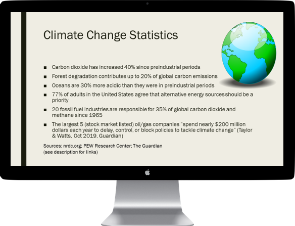
Guess the score for this slide…
Answer: 0 (OMG Please End My Suffering)
This one trips a lot of people up, a lot of people are torn between a zero and a one for this slide.
But nope. It’s definitely a zero.
There are TEN bullet points on this one slide.
Ten.
Look at all that text, it’s simply too much.
Now here’s the bad news: most academic or educational slides look like this and this is an emergency situation.
If you have slides with this much text, your audience will disengage and stop listening to you.
Maybe you’re thinking, “well my audience needs to meet me halfway, don’t they?”
Yes. They do. Absolutely.
But that means you need to meet them halfway, too.
And slides with this much text are not meeting them halfway.
Not even close.
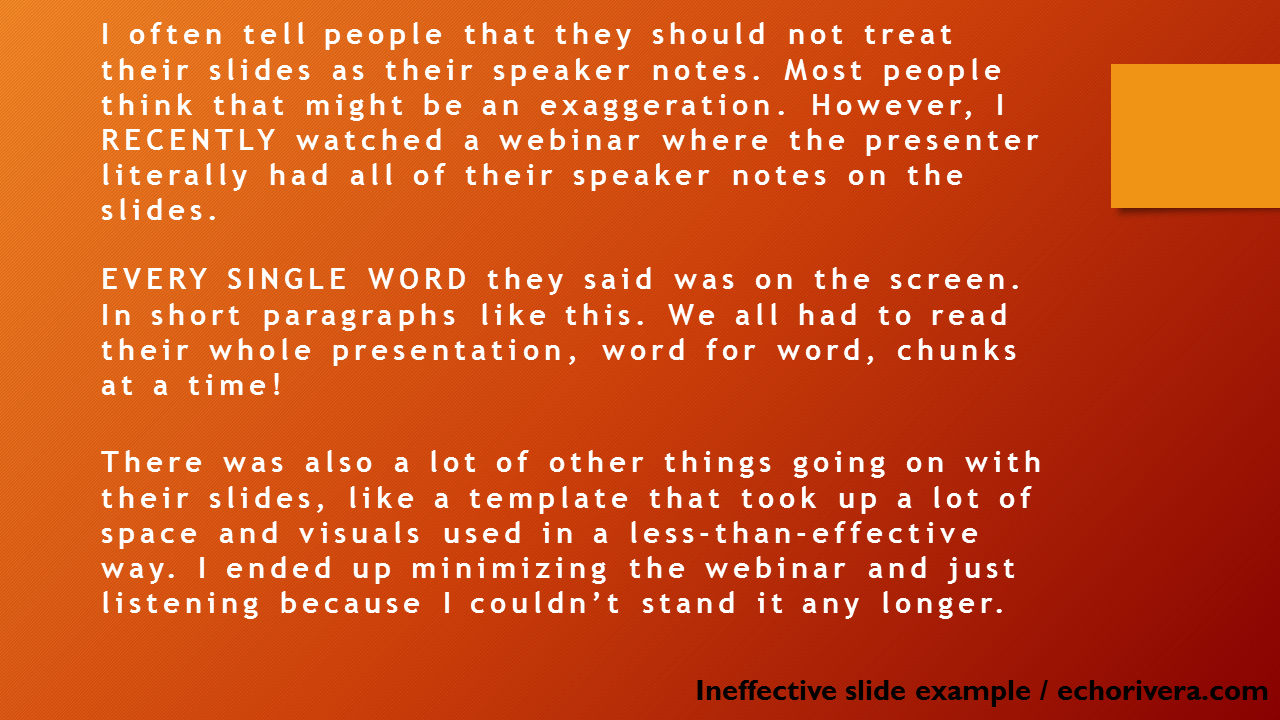
Guess the score for this slide…
Answer: 1 (Death by PowerPoint)
Alrighty, we’ve finally moved up a point on BATTS!
This slide is better than before because we do have less text (and it’s easier to see because of a large font size).
But you still hate this slide, right?
Because there are no visuals, and because it’s still a wall of text.
That template isn’t doing anything to help (because, templates like that never do).
It’s also not PowerPoint’s fault here (PowerPoint is actually a fantastic slide software!).
The problem is obvious: there is too much text.
So the question is: Is this slide in the “it could be better, but it’s okay for now” category?
Nope.
Slides like this must be prioritized and fixed. Less text, more visuals!
Hopefully, you’re enjoying this blog post so far, if so, you’ll love my FREE training.
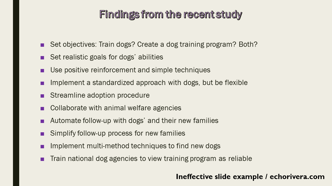
Guess the score for this slide…

Answer: 2 (Le Sigh, I'm Bored)
There aren’t any borders so it looks different than the others, but hopefully, you still get the gist :)
That little red circle on the bottom is the template design and it’s a pretty plain slide with 5 bullets.
It has less text than the others, which is why it scores better.
Even though it’s plain, this is overall a better slide because there is less text.
That’s how bad too much text is — it’s like throwing a bad apple into a batch of good apples. Too much text ruins everything.
But now for the question you’ve been waiting for: Is this an emergency situation that requires immediate slide design?
It depends 😅
(I’m such an academic sometimes, I know)
It depends on the rest of the presentation.
If you have a few slides that look like this and they’re your worst slides, then no. It’s not an emergency fix.
But if all or most of your slides look like this (or worse), then yes. Because overall your average BATTS score is 2 or less.
That’s usually the cutoff I suggest.
If you score 2 or less, then it needs to change.
If you score 3 or above, then you’re probably good!
Guess the score for this slide…
Answer: 3 (Okay, Not bad!)
There we go!
Now, do you see the difference? We have a much cleaner slide overall with significantly less text.
That means more breathing room for the text and for some visuals.
Sure, the visuals are all wrong and formatted in all the wrong ways, but hey. It’s a start!
Scroll back up to compare.
Wouldn’t you rather look at a presentation with slides like this instead of those earlier examples?
Guess the score for this slide…

Answer: 4 (Stellar Slide!)
Now we’re talking!
Bam. Look. At. That.
Wouldn’t you rather see this slide instead of any of the others?
And YES, professional audiences prefer slides with less text and more visuals.
Yes, even if they’re academics. Even if they’re scientists. Even if they’re researchers. etc etc.
Most professionals have average scores of 0 or 1 on their PowerPoint presentation slides, but it’s not their fault.
Hopefully, you now have a better sense of where your slides fall on BATTS.
If you’re like most academics, scientists, and educators then your average score is a 0 or a 1.
That’s because it’s the status quo to make #DeathByPowerpoint presentations right now.
But it’s not your fault.
I’m willing to bet your grad program didn’t include comprehensive training on how to give effective or engaging presentations, right?
You were expected to watch presentations and then create effective ones.
Even worse, you were expected to watch bad presentations and somehow figure out how to create engaging ones?
It doesn’t work that way, and that’s why you’re at this point.
However…you can’t unsee this blog post. 🙈
And you can’t unlearn that. I have FREE training to get you started. So make sure you check out that free training so you can start making stellar slides!
You do not need every single PowerPoint slide to have a BATTS score of 4.
Before you panic or get stressed out about what this means for your presentations, let me reassure you that the goal is not to have every single slide get a BATTS score of 4.
This is just a fun way to do an easy self-audit on your slides, so you can identify which slides are the worst and need the most help.
It’s a way to prioritize which slides to improve first.
For most presentations, it’s not practical or sustainable for ALL of your slides to have a score of 4 on BATTS.
The goal is to have them sprinkled throughout your presentation to keep up the pace and mix things up.
You do not have to jump from a 0 to a 4 in one go.
I’m always emphasizing that we’re playing the long game here.
The idea is not to make your next presentation the best ever. Don’t try to go from an average of zero to an average of four in one revision!
What I encourage my training participants to do is to move their average BATTS score one number at a time.
Let’s say all of your slides get a score of zero. Your first step is to raise your average BATTS score to 1.
Once your average BATTS score is a 1, then try to raise that average to a 2.
Then, finally, raise that average to a 3.
Should your presentation slides have no text and only visuals?
No.
A big misconception people have is that the goal is to have a presentation with no words at all, or only a few words the entire presentation.
That is not the case.
The magic happens when there is a great visual paired with some key words. It’s also important to look at the presentation as a whole rather than just a single slide.
Some slides can actually be 100% text, and one of the first things I train academics, scientists, and educators to do is create slides that look great in that situation.
There are actually ways to have a slide with a BATTS score of 2 that still looks fabulous and engages your audience.
But that involves applying several design strategies and that’s something I train academics, scientists, and educators about in my online courses and workshops.
Even then, well-designed text slides only go so far. It’s important to mix things up and balance those text slides with highly visual slides, too.
“But, Echo! what if I forget what I wanted to say from my presentation slide?”
Ahh, right!
I can’t close out this blog post without addressing this first.
If you’re still hesitating to remove the text from your presentation slide because you’re worried that you’ll forget what you wanted to say, I have something surprising to share with you:
The more text you have, the harder it is for you to remember what you wanted to say.
I’ll let you read that article to learn why that is :) It’s time to close up this blog post now.
If you found this post about adding too much text on Powerpoint slides helpful, you’ll love my FREE training!
Don’t leave without at least checking it out first :)
with joy,
Echo Rivera, PhD
Links shared in this post >>