How the unlikely step of removing text from my slides helped me remember what to say
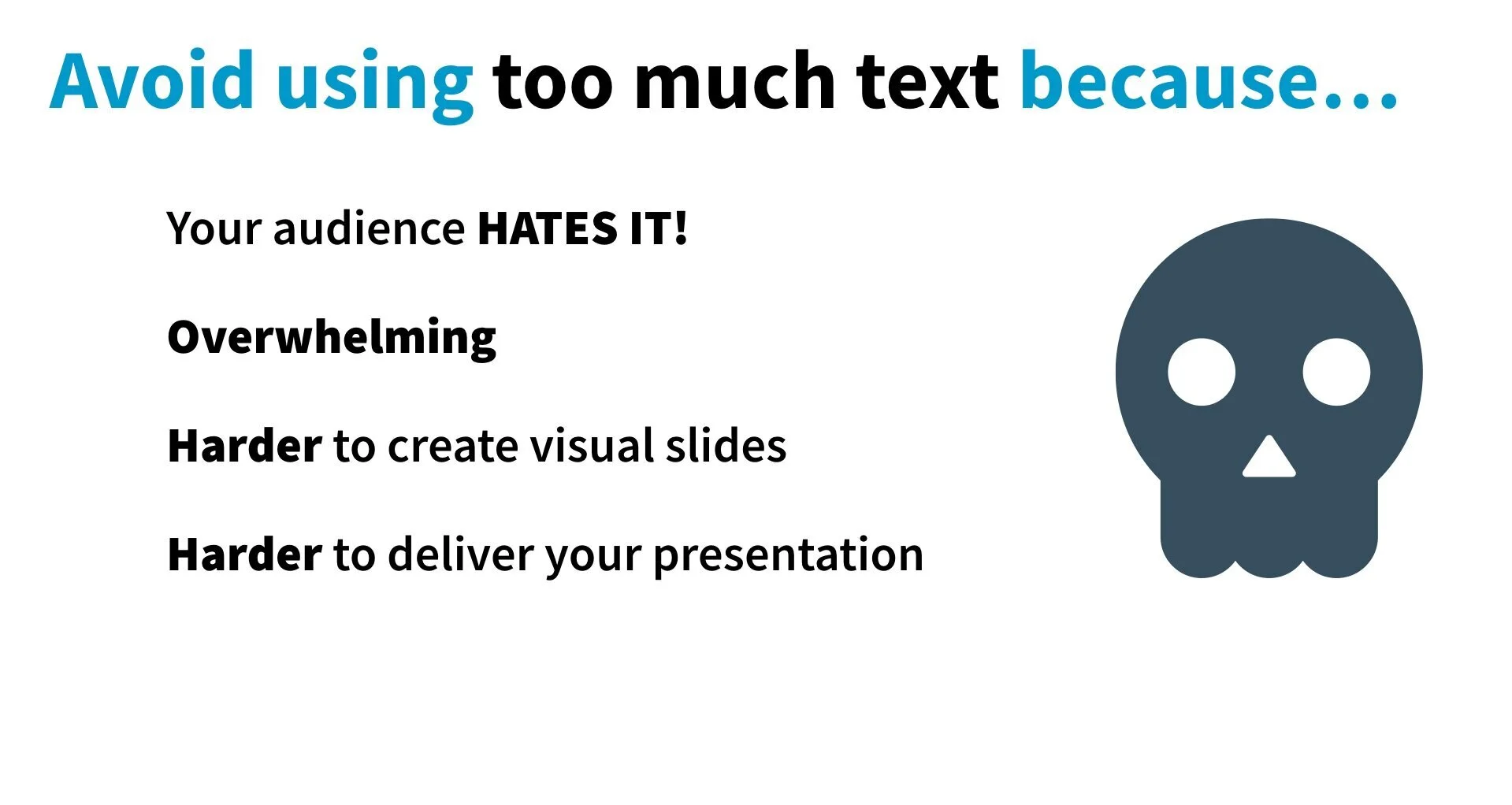
You have too much text on your slides.
You know it. I know it. Your audience knows it.
You also know that your audience hates it (because you hate it when you’re part of the audience).
But here’s the thing: I’m not judging you for it. Because I know WHY you have too much text on your slides.
Or, at least, if you’re like most academics, scientists, evaluators, and professionals I work with, then I know the reason: ANXIETY.
You’re worried that you’re going to forget what you wanted to say.
You’re worried that someone will ask you a question and you won’t know how to answer.
You’re worried that someone will say your presentation wasn’t professional enough.
You cram your slides full of text to ease your anxiety.
That’s why I’m not shy about my former fear of public speaking. It’s important for you to know that because it’s literally how I got to this point—training and helping others with their presentations. My coping strategy to reduce my anxiety was to put an EXCESSIVE amount of time and energy into my presentations. Both in terms of design and practicing/memorization.
I was getting tired of throwing up before a presentation and shaking the entire time. People suggested Toastmasters. That sounded like something out of one of my presentation-anxiety-induced nightmares (No hate on Toastmasters, I do hear it’s a wonderful opportunity and I encourage others to try it!). But… there was no way I was going to do it.
So I handled my anxiety the only way I knew how: I spent 3x as much time/energy as was necessary to make presentations where (a) everyone paid attention to my slides instead of me, and (b) I didn’t make an ass out of myself.
I also started by having my entire speech on the slides.
Like I showed you in a previous blog post, I didn’t start by having effective, engaging, visual presentations. I started just like you: slides with tons of text, bullet points, clip art, wild and excessive animations—all on a template.
But somewhere along the way, I began slowly removing text from my slides and that’s when everything changed.
Let’s go back to the past and think about what really happens when you present using those slides full of text.
1. You’re working on your slides and…
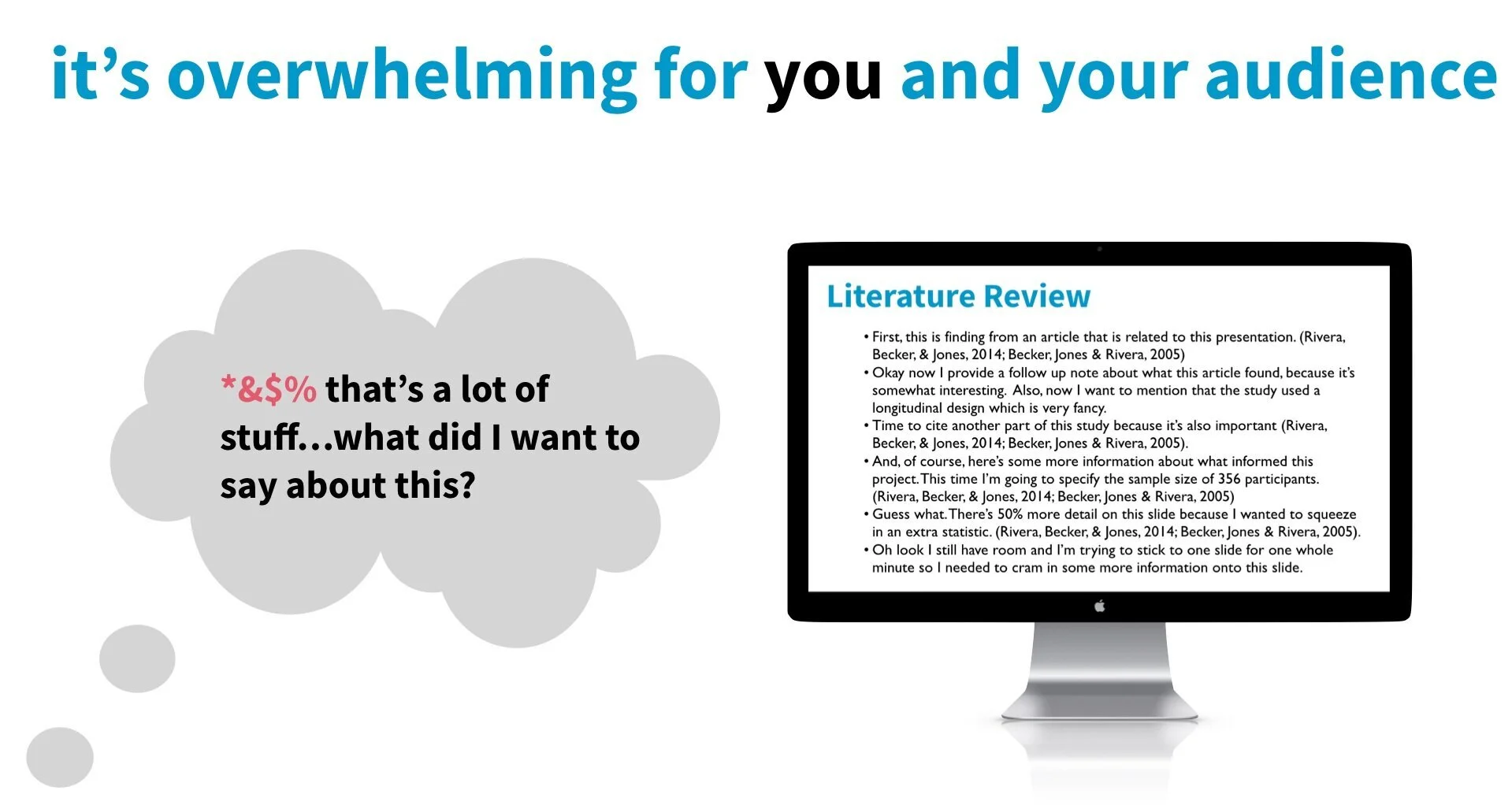
…Chances are, if you’re like a lot of people I work with, you didn’t exactly start your presentation early. You probably had to rush through it, and probably didn’t have time to practice. While writing your slides you probably had some level of recognition that there was a LOT of text, but you probably convinced yourself:
“I won’t actually read these slides word for word…I’ll just glance at this, say some stuff, and this text will just be there as a reference.”
2. Now you’re presenting your slides and…
You’re in the middle, you realize you’re actually running out of time (and maybe even getting a little bored with your own slides), and then — out of nowhere — you switch to a new slide and …
your mind goes BLANK.
After all, you’re only human and can’t process ALL THIS INFORMATION in 0.5 seconds…and now you have a ton of eyes staring at you.
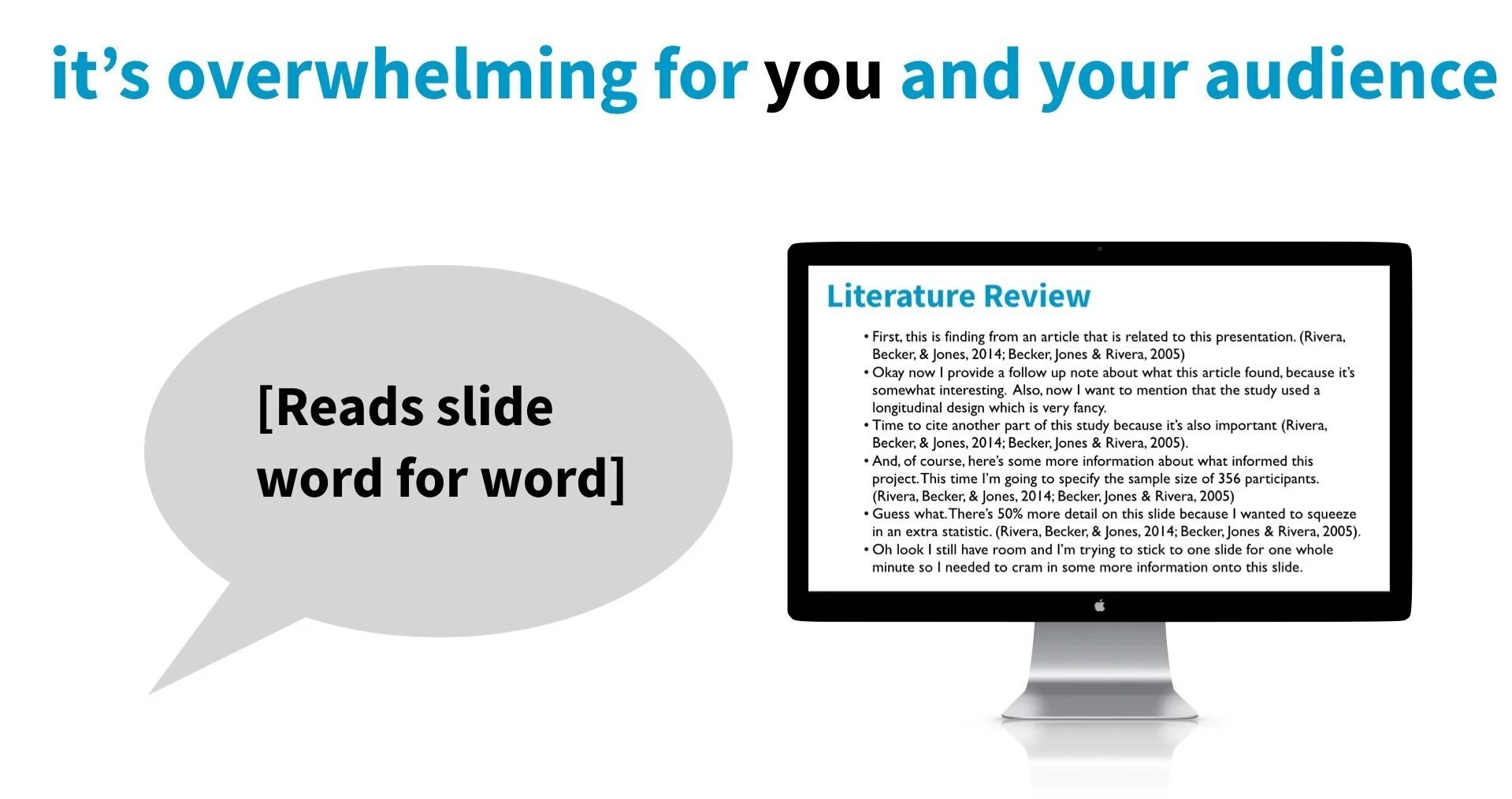
The awkward silence feels like it stretches for a full hour (even though it’s probably only a couple of seconds), but you feel the pressure mounting and you have NO CHOICE but to start reading your slides word for word.
And/or at some point you realize you can’t just read your slides word for word so you do something that’s EVEN WORSE.
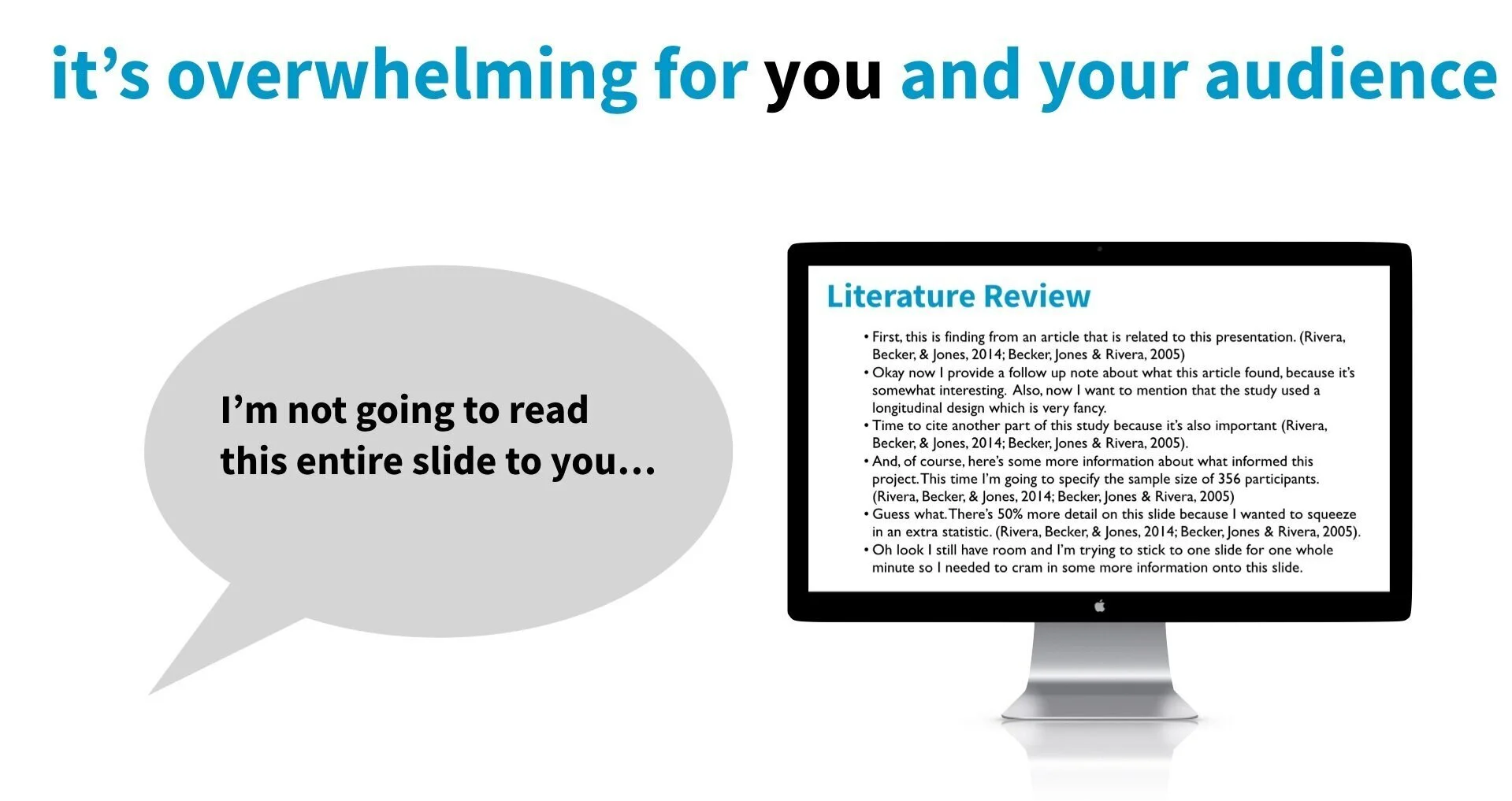
You say something like, “Oh, I’m not going to read this entire slide to you…”
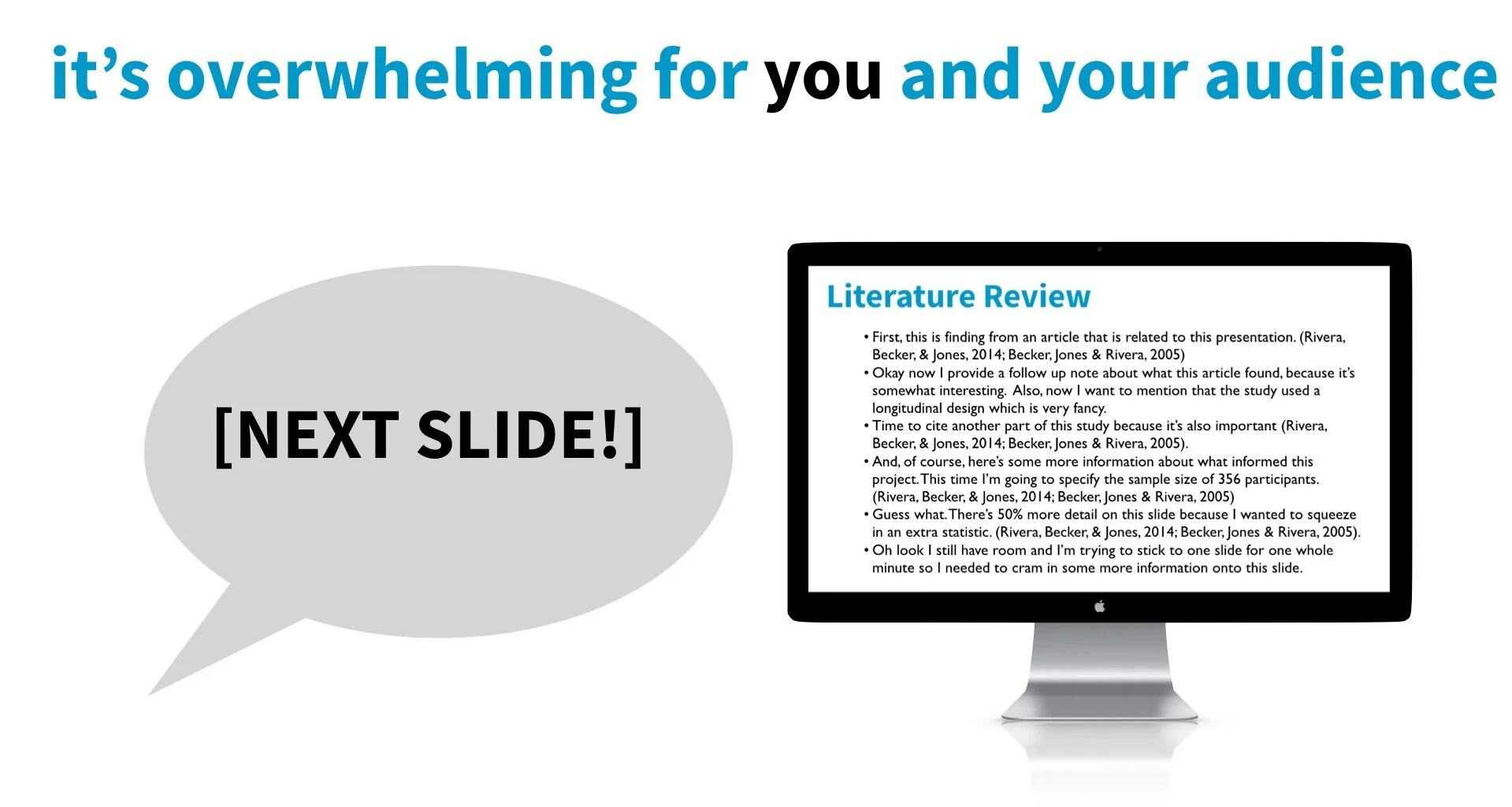
And then you start skipping through your slides.
GAH. This is — along with reading text from your slides — the FASTEST way to get people to disengage from your presentation. This is just as (if not more) frustrating to your audience as you just reading your slides to them.
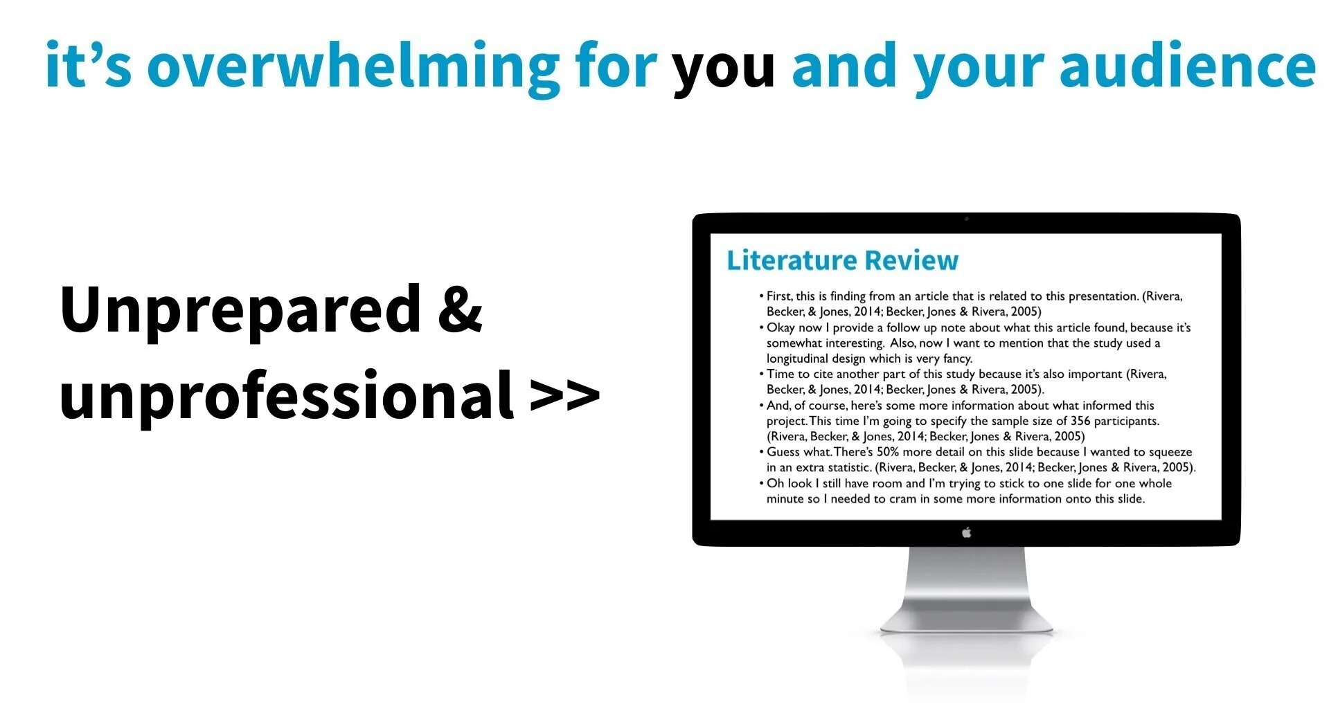
Everyone I work with is worried about being judged as “unprofessional” for having slides with less text and more visuals.
This, frankly, confuses me because it’s hard to believe that anyone finds this type of presentation “professional.” When you’re in the audience and the slides look like that, the presenter reads the slides to you, and/or starts skipping slides…do you really sit there and think “Wow! How professional?”
I’d be really surprised if you did because, to me, that screams unprepared and unprofessional.
3. Now your presentation is done and…
You feel bad about yourself.
You know you didn’t do as well as you wanted.
You know it wasn’t engaging.
And humans are a funny thing. When we feel bad (embarrassed, ashamed) about something we did…we aren’t very good about changing our behavior in the correct ways to avoid those feelings in the future. Instead, we either avoid anything that reminds us of the experience, or cope in harmful ways.
For example, most people after experiencing this will decide to put MORE text on their slides the next time, rather than implementing strategies that will actually help their presentations be more engaging (and easier to present from).
It’s such a downward negative spiral and I see it ALL. THE. TIME. This is usually pretty unintentional and happens without us realizing it. That’s why I’m writing this post.
You are not alone in this — not even close! It’s REALLY common to do this!
So, before I go I want to say that you’re not alone in this. It’s really, really, REALLY common. That’s why I made sure to emphasize in the beginning that I’m not here to shame you or make fun of you. I’m here to let you know that I get it, that I understand.
There is a better way, and I know YOU can do it!
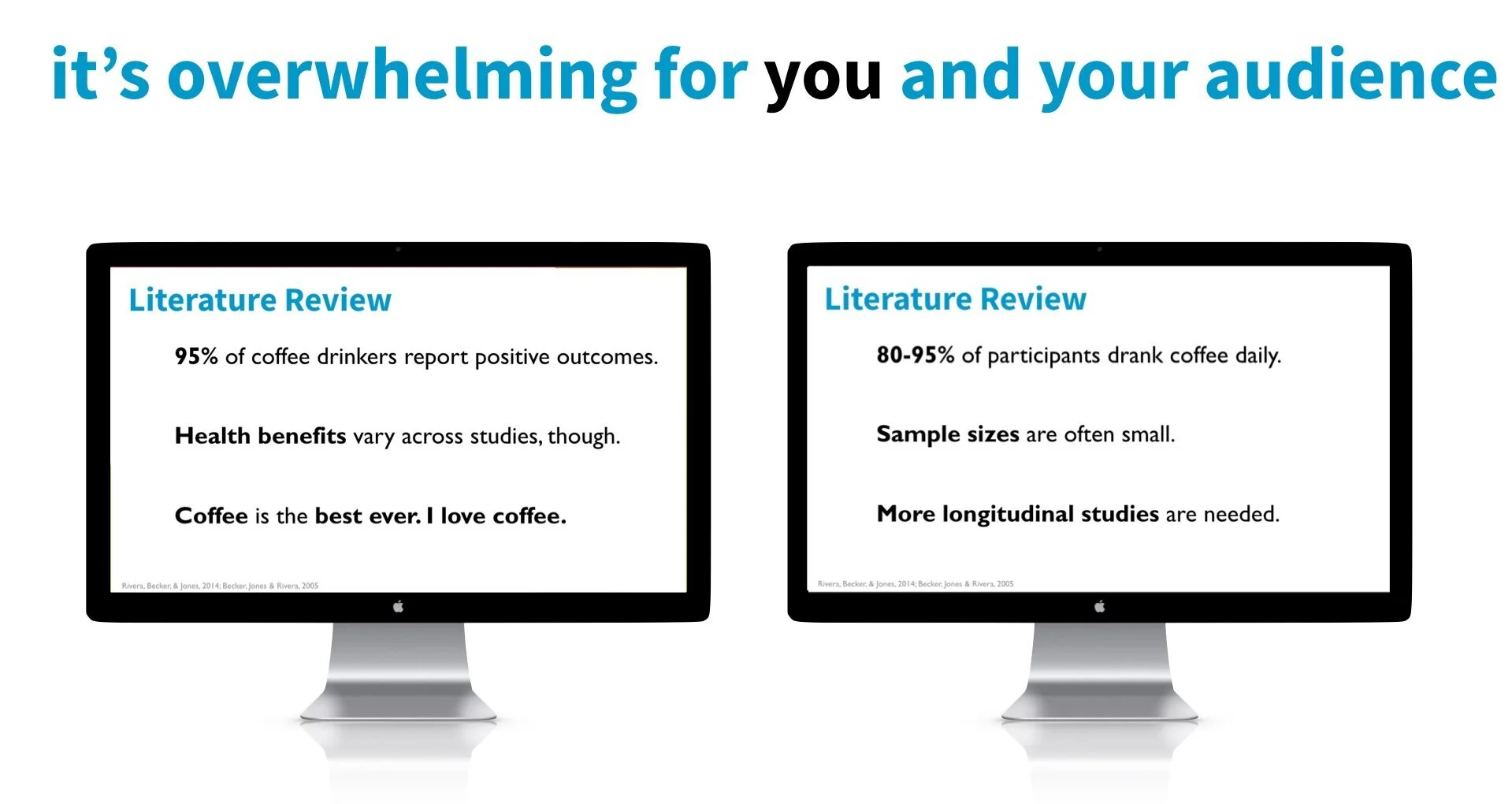
I’m also writing this post to let you know that there is a better way. Remember how I mentioned that when I started to remove the text off my slides, that’s when everything changed? That’s because once I started to remove the text off my slides (in combination with my practice strategies, of course) it became EASIER for me to remember what to say DURING my presentation.
If you look at things visually, it’s easy to see why. Here are those same slides as above, but with less text crammed on the slide. This would be much easier to glance at and use as a reference compared to all that text.
So, I know you’re anxious and YES, it does mean you have to be familiar with your presentation slides and content (but I feel like that should be obvious?). But I recommend that you give this a try and, again, especially in combination with my practicing strategies. I think you’ll be pleasantly surprised at how much better you do when you present, which over time will increase your confidence and reduce your pre-presentation anxiety.
Did you learn something new or interesting in this blog? Want to learn more?
Then check out my FREE training course that you can binge watch right now!
with joy,
Echo Rivera, PhD
Links shared in this post >>
Additional Reading >>


