
9 Myths Holding You Back From Creating Stellar Slides

You're ready to be an effective presenter, I can tell.
How? Well, because you're here reading this post. And I'm guessing part of that is because you've already noticed that some of the advice you've been given is unhelpful and are curious to see if that advice made it to this list.
I've been informally helping colleagues with their presentations for years.
So by now, I've collected a list of common myths, misconceptions, and misinformation that I usually need to help people "unlearn."
Are you ready to let go of bad advice so you can start creating some stellar slides? Let's get started!
But before we do, you should know I have a free training!
1. # of Slides = X Amount of Time
This is the most common myth I come across, and it goes a little something like this:
"The presentation doesn’t need to be that long. Echo can you draft about 10 slides?"
This is deadly. If you frame your presentation by the number of slides (and you aren't doing an Ignite presentation) then you've just set yourself up to fail.
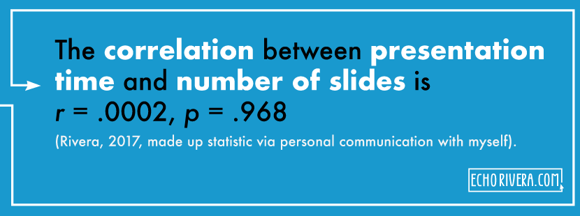
Ergo, your first step towards becoming an effective presenter is to completely disassociate time from the number of slides in your presentations. Pretend like the correlation between presentation time and the number of slides is r = .0002, p = .800 (Rivera, 2017, personal communication with myself).
Why? Because relating the two gives you tunnel vision about the number of slides and causes you to make horrible slides crammed with content just so you can stick to an arbitrary rule.
Take, for example, the arbitrary 10-20-30 rule. The 10-20-30 rule says to do 10 slides for a 20 minute presentation. I forgot what the 30 is (minutes?) but that's not important.
10 slides. 20 minute presentation. That's TWO WHOLE MINUTES for each slide (at best)?
In audience years, that's essentially forever. Please, don't stay on all your slides for that long. I beg you. Even 1 minute per slide (another arbitrary "rule" I've heard) -- for every slide in your presentation -- is too long.
"But I need to explain a complex topic, Echo, you're wrong!"
No, I'm right about this one. When you have a complex topic, you should be breaking it up into multiple slides to walk your audience through it. You should not be spending a lot of time on ONE slide.
Do not worry about the number of slides you have. Do your best to only share 1-3 points (or sub-points in the case of a complex topic) per slide. Your audience will thank you.
Why is this rule so popular?
I think some cling to this myth and arbitrary rules because they're picking up on the reality that most people present in an ineffective way. That most people cram 50+ words on a slide and blabber on forever and then repeat that for the next 20 slides.
I think people, including you, are frustrated with boring, ineffective presentations. Telling people to limit their slides feels like low-hanging fruit. But the number of slides is not the root of the problem. The root of the problem is tied to the remaining myths I describe in this post.

2. It's the audience's responsibility to pay attention and learn
I've met some people who believe the responsibility of learning rests solely on the audience. I disagree.
Effective presenters have internalized the idea that it's the presenter's responsibility to do everything they can to make learning easy, fun, engaging, and memorable for the audience.
Does that mean it's your fault if a student is confused, bored, or doesn't care? Is it your fault if a conference attendee stares at their phone the whole time you're talking?
No, not necessarily. People are overworked, distracted, and exhausted. It's an uphill battle to capture and hold their attention.
But chances are, there are strategies you could be following to make your presentation worth paying attention to and remembering. Things like good storyboarding and visuals.
3. Visuals are just a bonus
If you want your audience to pay attention to you and if you want them to understand, remember, and use the information you share, then use visuals. Period. No excuses. Fin.
By visuals, I don't just mean stock photos. Visuals also include:
Drawings or art
Screenshots
Icons
Gifs
Dataviz
Your own photos (that you took)
Videos
Check out my blog post/video about creating a visual database.
4. "I have a lot of data" is a legit excuse for bad design
Whenever I tweet or write a post about how you should limit the amount of content/text on your slide, there's always someone who says, "Yeah I mostly agree, except when I have to show a lot of data."
That is not a reasonable excuse to ignore good design and make ineffective slides. You do not have to show all your data at once on a slide. You should be walking people through your data in pieces and in a way that tells a story.
5. "But I need to post my slides online" is a legit excuse for using too much text
Whenever I tweet or write a post about how you should limit the amount of content/text on your slide, there's also always someone who says, "Yeah I mostly agree, but what about slides that need to live online?"
The solution to this problem is not to create overwhelming slides that are crammed with text. It makes your actual presentation worse, and it doesn't help as much as you think later on anyway. Instead, it's better to create a nice handout that has the detail people will need. It doesn't take that much time and is the best way to make sure BOTH your real-time presentation is great, and so is the version you post later. But to give you a head start, the key to addressing this is to have a solid workflow.
Hopefully, you’re enjoying this blog post so far, if so, you’ll love my FREE training.
6. Good dataviz is enough
Dataviz is hot right now, as it should be. It's about time we started caring about how our data looks and what story it tells when we present it.
But here's the thing: good presentation design involves more than dataviz. Good presentation design means:
A good story (storyboarding) or good content
Good information design (contrast, hierarchy, fonts, colors, alignment, etc)
Legal, ethical, and effective use of visuals (placement, size, orientation, type, etc)
Data visualization, when applicable
Presentations aren't "good" or "bad" based on one slide or a couple of slides. Presentations are a package deal.
To me, data visualization is one of the last steps in a good design package. Because, if you don't have a good story -- or if you cram a bunch of data on one slide -- then your dataviz won't have an impact.
If you don't use good design and visuals throughout your whole presentation, the dataviz will stick out in a bad way. Like it doesn't belong. That's assuming they're even still paying attention, because if you present for a while without good design, then you've lost them by the time you reveal your dataviz.
7. Your audience cares about you (or the facts) more than the story
Speaking of telling a good story, you need to do that if you want to resonate with your audience.
One example of where we lack a good story is how we start our presentations. A huge mistake I've made in the past, and see almost every other presenter make, is that we save the good stuff for the middle or the end (e.g., results) without giving the audience a reason to pay attention all the way through.
The kiss of death? Starting a presentation by talking about yourself.
For example: "Hi, I'm Echo Rivera, I work at this great organization, and my research background is in domestic violence, which I’ve been studying for 10 years now, blah blah blah."
Sorry to say it, but unless you’re a celebrity in your field, your name/background is not the most important thing to people at that time. It's better to assume that no one cares who you are. Even if they're peers, even if they're your students and you're in the middle of the semester, even if it's your mom. Get into the mindset that you need to convince your entire audience they should listen to your content.
Assume they're at your presentation because they have a problem and they want you to solve it (with a story).
Your background won't solve their problem. That’s why you need to start your presentations by reassuring them you’re going to solve their problem. Yes, the problem can simply be a knowledge gap, but you have to make that clearer and more interesting than you're already doing.
8. It's okay to take "baby steps" ... for years
OK look. I believe that change is incremental. If your slides have 130+ words on them and contain no visuals, it'd be really hard to all of a sudden make slides with only 3 words and all visuals.
But, the only time I've heard "cut me some slack, I'm taking baby steps" is when people are using it as an excuse to maintain the status quo of their outdated, ineffective practice.

It's like watching someone sloooowly remove a big band-aid off their arm.
So if you're telling yourself that you're just making changes in "baby steps," then challenge yourself to take bigger steps. You don't have (or need) 30 years to start making stellar slides, there's no reason to draw it out that long.
9. I don't need training on how to create effective presentations
Did you receive formal training on how to create effective presentations and be an effective communicator? I think the reason there is no formal training is because of this myth out there that effective communication is just a natural talent or something that can be "picked up" over time.
Not true, and I talk about that more in this post.
Were you able to pick up statistics just by watching other people present their findings or click through SPSS menus? Would you have been able to do research or evaluation without your graduate training? There are graduate degrees in communication, yet many of us assume we can learn the same strategies on our own.
Creating and delivering effective presentations or communicating our work effectively requires training and guidance. Yet, we don't really get formal training in how to create effective visual presentations or lectures. So even though you obviously care about being effective, there's not much guidance out there.
...But that's what I'm here for :)
Thanks for reading!
with joy,
Dr. Echo Rivera
Links shared in this post >>