
How to make visual presentations: 7 types of visuals you can use in your presentation slides right now
Are you ready to make visual presentations?
I’m so happy to hear that!
If I had to sum up the cause of #DeathByPowerpoint in a few words it would be: Too much text, too few good visuals.
If you’re an academic, scientists, or educator who wants to make better presentations, then you need to use good visuals in your presentations.
Using great visuals is one of the easiest and most effective ways to get your audience to:
pay attention
understand
remember, and
use the information you share.
Giant walls of text do not help you achieve any of those goals.
Hi! I’m Dr. Echo Rivera and I help academics, scientists, and educators create engaging presentations.
Although this post is exclusively about visuals, it’s important that you reduce the amount of text you have on your slides, so you have room for great visuals.
But you probably know that presentations need visuals, right? That’s why you’re here, reading this post.
So here’s something you might not know: It’s not just about having any visual in your slides—you need to have good visuals.
A bad visual doesn’t achieve those goals, either.
Let’s talk more about the difference between good vs. bad visuals, and then I’ll share ideas for 7 types of visuals you can use in your presentations.
In this blog post, you’re going to learn:
What makes a visual “good” or “bad”?
Seven types of visuals you can use in your presentations.
This blog post was written specifically for academics, scientists, educators, and similar presenters.
In other words, this blog post is for people who share educational information using slides.
Before I get started, I want to make sure you know about my FREE training video.
Good visuals vs. bad visuals—what is the difference?
A good visual is one that makes it more likely for you to achieve those above goals.
What goals, you ask? Getting your audience to pay attention, understand, remember, and use your information.
A bad visual is one that makes it less likely for you to achieve those goals.
Sounds easy enough, right?
Let’s talk specifics.
Visuals DON’T make an impact when they are:
Too small
Distorted
Formatted or cropped improperly
Distracting
Forgettable (aka “meh”)
A mismatch with the slide content
Evoking the wrong emotion
I’m guessing you’re nodding your head in agreement. All of those things sound like they would hurt your chances of making an impact, right?
Well, most academics, scientists, and educators are using visuals that don’t make an impact. That includes me, several years ago.
Chances are high that you are, too, and you don’t even realize it.
Most people think I’m talking about things like cheesy stock photos.
And, they’re not wrong—those are bad visuals.
But during my presentation workshops, professionals are always shocked at the examples I provide of “bad” visuals.
Many participants share that some of their favorite visuals are on my list of visuals to avoid.
Examples of bad visuals:
Word clouds
Most modern forms of vector/digital clip art
Bubble people
Humans coming together to form shapes
Disembodied hands shaking
Cheesy stock photos
Did you see something on the list that you use?
Don’t feel embarrassed. I’ve used every single one of those visuals in my presentations before.
How were we supposed to know what visuals to use in our presentations? It’s not like we get trained on this in grad school!
Plus, until 2014 or so we had one of two options:
Pay a lot of money for cheesy stock photos of white people, or
Use Office clip art and PowerPoint SmartArt.
So, I’m not making fun of you (it’s not my style). I just want to make sure you’re able to go through your presentations and delete the bad visuals you have in there.
I’ll focus on one as an example: word clouds.
I remember when I first saw word clouds. I thought they were the coolest things ever. I used them every chance I could.
Until I realized they were just a way to cram even more text into my slides.
Take a look at this slide with a word cloud:
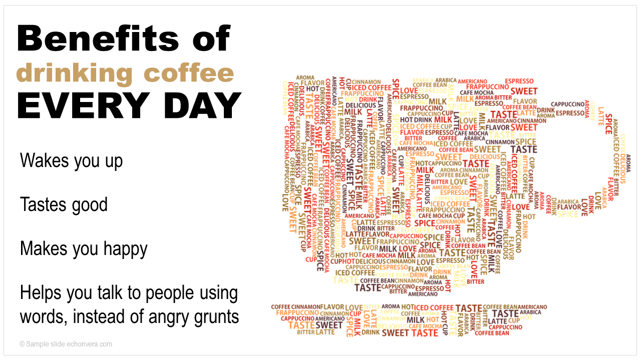
What emotions do you feel while looking at hundreds of words, in multiple colors, forming the shape of a coffee cup?
Nothing probably.
And you’re going to forget this image the second it leaves the screen.
Word clouds are forgettable, at best. At their worst, they’re distracting, confusing, and stressful.
That’s what makes them such a bad visual.
But it’s more than that.
Let’s think about this. What is the visual here. Do we even have one?
I argue we don’t.
Stylized words is still just that: words. It’s still text.
That is still a text-heavy slide, in my professional opinion.
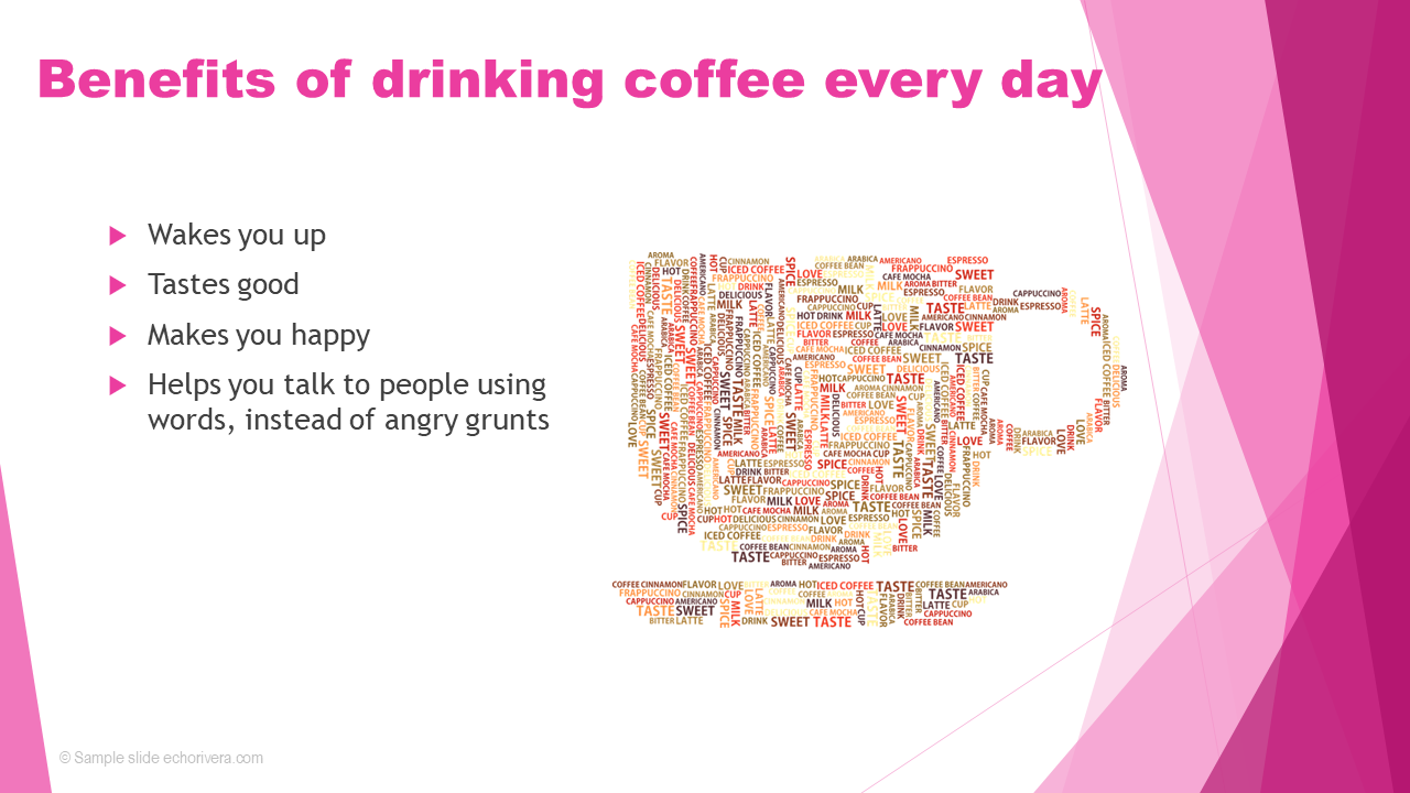
So, what would a good visual look like?
Something like this:

Ahhh, see?
Now you probably had much more of an emotional reaction. If you’re a coffee drinker like I (obviously) am, then you probably can almost feel the warmth of that cup.
You can picture yourself wrapping your hands around the warm cup and taking a sip. Feeling that rush of caffeine…
Plus, do you see how something like this good visual will be more memorable than the word cloud.
That’s what you want.
Do you see how choosing the wrong visual can ruin a slide?
And I didn’t even cheat.
I actually tried to design a nice slide using a word cloud. I could have done what most people do, which is throw a word cloud on top of a template with some bullet points!
Slide templates are never the solution. They will never help you end #DeathByPowerpoint, and one of the first things to do when you’re ready to make better presentations is to stop using them.
And PowerPoint SmartArt is a type of template—you shouldn’t use those either. I’ve written an entire blog post (with before and after makeovers) about why PowerPoint’s SmartArt is not a good visual.
It’s really important to consider all of the elements on your slides and only keep the ones that help achieve our key goal (getting our audience to pay attention, understand, remember, and use the information we share).
Ok. Enough about bad visuals, let’s talk about good ones!
Visuals DO make an impact when they are:
Big enough
Formatted properly
Memorable
A match with the slide content
Evoking the right emotion
Now that you have an idea of good vs. bad visuals, let’s talk about 7 types of visuals you can use in your presentation.
1. Use stock photos for your presentation slides
When I’m giving a presentation training workshop, I ask people what types of visuals they should avoid, and a lot of them say “stock photos!”
I see where they’re coming from. The term "stock photo” has become synonymous with “cheesy stock photo of white people smiling at the camera.”
That’s because, until 2014 or so, that’s what stock photos were.
But things have changed. A lot.
And for the better.
So erase everything you thought you knew about stock photos and let’s start from scratch.
All “stock photo” means is that it’s a photograph taken by someone else, so others could use it for something.
That’s it. That’s all it means.
And stock photos are the #1 type of visual you should use in your educational presentation.
As of 2021, is actually pretty easy to find stock photos that are:
Free
High quality
Memorable in a good way (i.e., not cheesy or forgettable)
Here are four examples of how I’ve used stock photos to create engaging presentation slides.
These are actual slides I’ve used for either educational presentations, doing before/after makeovers, or when sharing evaluation data results.


Tip: Royalty free does NOT mean free to use
I've noticed that a lot of people incorrectly use the terms "royalty free" as interchangeable with "cost free."
Royalty free means you don't have to pay the creator each time you use it or make money from it, but you usually still have to pay for the initial license.
Cost free or free to use means you never had to pay for it, but there may be other license requirements, like giving credit (attribution) every time you use it.
Tip: Copyright still applies to you even when you use photos for non-profit, educational purposes
A lot of researchers, academics, and scientists think that just because they're using photos for education (i.e., non-profit use), they're exempt from copyright laws.
Or, they know the law applies to them but think copyrighted pictures are considered under “fair use.”
Tip: Stop using Google Images to find stock photos
Most people are still using Google Images to find stock photos, so I need to talk about that for a second.
It’s also the most risky in terms of copyright violations.
I describe a faster and safer way to find visuals and to create what I call a Visual Database.
If you feel like it takes you forever to find visuals and/or add them to your presentations, then make sure you read that blog post next.
2. Use icons for your presentation slides
Icons are one the easiest and fastest ways to add visuals to your slides. They’re a great place to start if your slides are mostly text.
You can find icons at flaticon.com, but I just use PowerPoint’s built-in icons.
There are tons of them, and they all meet the modern standards for good icons. That’s important because if you aren’t careful, your icons will start to look like clip art.
You want clean, simple, and modern icons—that’s exactly what the built-in icons in PowerPoint are.
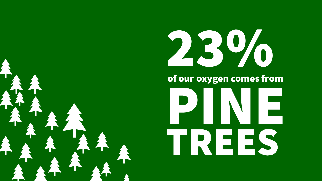
I use them to accompany large numbers or single percentages. This isn’t real data here, just a mock up I made for a blog post about how to visualize this type of data.
I use them for teaching purposes, too. For example, in my presentation training, people learn the #1 enemy in presentations — the ONE thing you must avoid.
I use the icon of a wrench to symbolize that “enemy” and create a theme for the entire presentation.
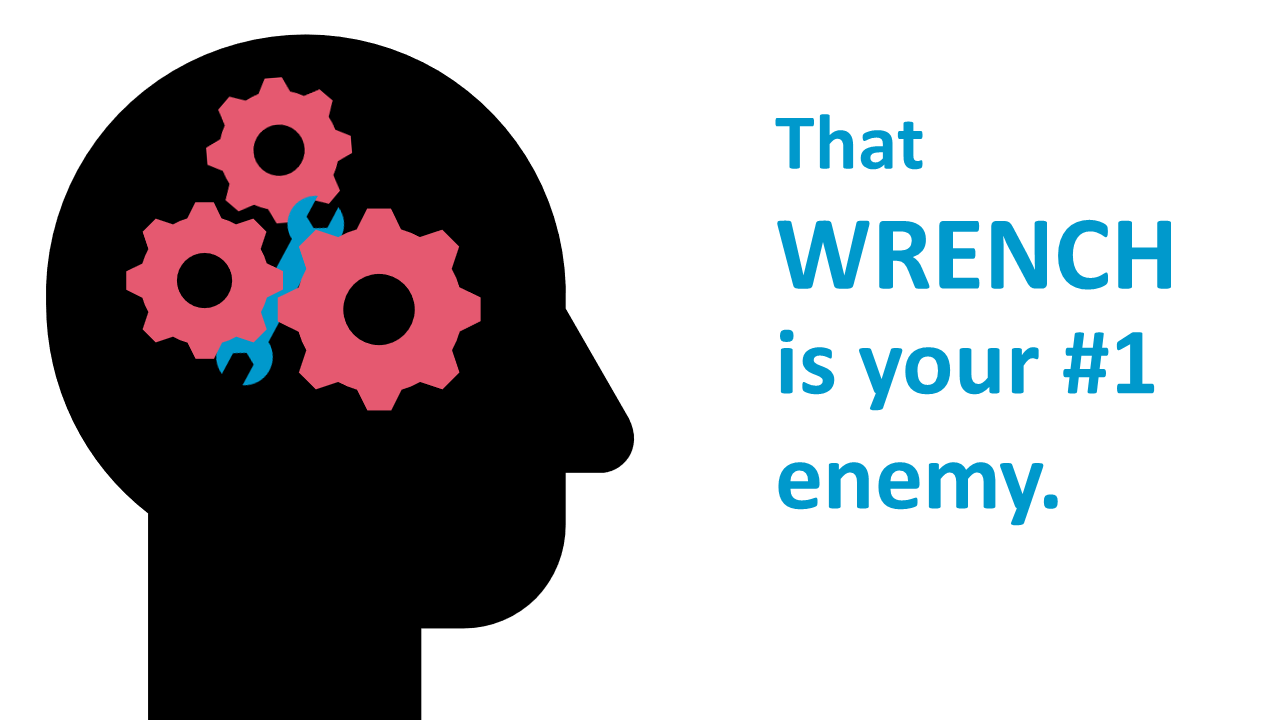
It works well because it sets up a simple, common visual (wrench) that we can all use and reference throughout the training.
I also love to use icons for interactive moments, like this one.
One reason I love PowerPoint icons so much is because it’s easy to do some “icon hacking” and make them even better. The visuals you see above are a combination of PowerPoint icons.
If you have not tried using PowerPoint icons, then I strongly encourage you to start using them in your next presentation.
3. Use your own photos for presentation slides
I see a lot of people using stock photos, so you probably already knew about them.
One thing I rarely see is presenter's own photos, and that's a huge missed opportunity.
Some of the best photos I use are ones I took myself.
And, no, I'm not an expert photographer and many of my photos would not look good on a slide. But, when I do take a gem, I try to use it in my slides.
One of my favorite examples is this pic I snapped of my two dogs -- Biscuit (left) and Sage (right) -- that I used to explain inter-rater reliability to a group of practitioners.

It was a hit!
After that presentation about validity and reliability, I heard from non-researchers that the presentation was engaging and interesting. A loose quote was, “I know all this academic stuff should be complicated, but the way Echo explains make it easy to understand.”
If that’s what you want to hear from your audience, then using great visuals will help get you there.
Has this post been helpful so far? If so, I bet you’ll LOVE my free training!
4. Use your own drawings & illustrations for presentation visuals
Don’t skip over this section!
Let me bust a few myths about this one right now:
MYTH: I can’t do this because I suck at drawing
Good!
Your audience doesn’t want to see an elaborate masterpiece on the slide, anyway.
The scrappier the drawing, the better.
MYTH: I can’t do this because I’m not “a creative”
First of all, you are absolutely creative.
Second, not that it matters because it doesn’t take any creativity to draw a square or a stick figure saying something.
Finally, being able to take your text-heavy slides and create your own visuals for it is a skill that you can develop with training, support, and practice.
MYTH: I can’t do this because it’s unprofessional
Yeah? Says who?
Because in my experience, audiences LOVE when the presenter uses their own drawings.
I mean, yeah, don’t do this for your job talk. But other than that, go for it.
Look. This whole myth of "being professional" seriously gets in the way of my peaceful protest against #DeathByPowerpoint.
Hand drawings are more likely to catch the attention of your audience than a great stock photo or any other type of visual.
They’re also fantastic at helping your audience understand and remember the material.
I'm still waiting for a legitimate argument that being ineffective and boring at presenting is somehow professional.
MYTH: I can’t do this because I don’t have professional software or can’t afford Adobe Illustrator!
Good news: You can draw directly in PowerPoint!
Also: We don’t use Adobe Illustrator.
We use the MUCH more affordable (and easier to use) app called Affinity Designer (bonus: members of my course get a discount on it, too).
Example drawings and illustrations
Sometimes, it's impossible to find a visual that works for your slide.
When it's an important point you want to make, or when you want to connect/resonate with your audience, then your own doodles can come to the rescue.
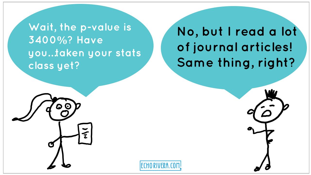
Here is a very simple set of 2 slides. I was making the point that watching presentations—even if they’re really great presentations—does not effectively teach you how to create effective presentations.
I drew a couple stick figures, then added speech bubbles.

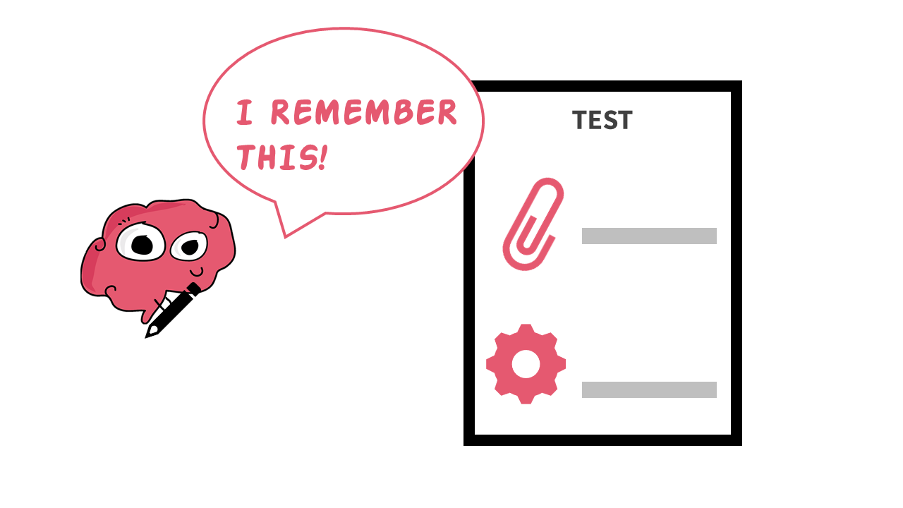
I also combine my own illustrations with icons. I drew the brain using professional illustration software, and then everything else (pencil, paperclip, gear) is a built-in icon from PowerPoint.
Notice the icons aren’t all black—that’s because you can change the colors of PowerPoint icons easily, which is another reason I love them so much!
5. Use emotion-focused Gifs on your presentation slides
Gifs are a great way to add some fun and surprise in your presentation. Use a gif when you want to evoke an emotion from your audience.
For example, use gifs when you want your audience to laugh out loud.
Maybe you know you’re going to tell them something they don’t want to hear. Something that might be hard and will conflict with what they’ve heard before.
You can use a funny gif to both lighten the mood while also letting them know you understand them.
What you would do is state the information upfront, and then maybe you use a gif like this (below) to say something like “I know! I know what you’re thinking. This conflicts with what you’ve heard before. Hear me out.”

If you can get them to laugh (while showing them you understand them), they’ll be more likely to hear your difficult message.
Use gifs when you want the audience to understand how YOU feel (or felt).
For example, maybe you hypothesized that X would happen, but Y happened instead. Or, maybe you designed your study one way but then something happened where you needed to change the design.
Or, maybe this isn’t your study, but instead you’re teaching students about research others have done.
Give your audience a visual clue about whether that is:
Amazing news!
Fine.
Not great, but also not the end of the world.
A complete and utter disaster that made you (them) want to burn it all down.
There are gifs for all of the above.
Not only will using gifs for this purpose humanize the information you’re sharing, it will be memorable. If you can ignite your audience’s emotions while sharing educational information, they are much more likely to remember it later on.
Use gifs when you want to let the audience know you understand how they feel right now (or give them a cue about how they should feel about the information you just shared).
For example, a lot of people are worried that visual presentations are “unprofessional” or they will be called unprofessional for having a lot of visuals.
So, to debunk that idea, I go into detail (with examples) of what a “professional” presentation would be, then. After going through all the detail and showing the audience terrible slides, I end with this gif:

By the way, you can also create your own gifs using your illustrations! Here is one I made that makes it into most of my presentation training webinars. This is really easy to do in PowerPoint now!

We all relate to gifs, so there is no reason to avoid it as a teaching tool.
Ok, one reason: job talks. Don’t use them in a job talk.
6. Use memes on your presentation slides
Use memes in a similar way to how you would use gifs—to evoke emotions and connect with your audience.
You can find memes online easily. This is the only time I ever use google images, because memes don’t have the same copyright concerns as regular photos do.
Plus it really is the fastest way to find a meme. They’re highly searchable because they’re so specific.
You can also create your own—just search “meme generator” and you’ll find one. You can usually find the image of a meme without the text, so you can add your own, too.
There are some classics that still tend to get people to laugh and make your point:

But you’ll want to be careful about using memes that are too outdated.
There is no universal list of “memes are outdated” and this is not something everyone will agree on. One meme that I think should be shelved is the “winter is coming” memes. But then again, I’m sure there’s someone out there who thinks the Liam Neeson memes are outdated.
If you start noticing confused faces instead of smiles and head nods, then it’s time to switch to something new.
A word of caution when using memes.
Gifs are great because they show a very clear and strong emotion. It’s really hard to misinterpret a gif and the audience doesn’t need any background knowledge to understand a gif.
For example, even if you’ve never seen Schitts Creek (omg, why would you do that yourself), you could still understand that gif I used above.
A meme, however, can sometimes require background knowledge of the content of the meme.
Have you ever had to google what a meme meant?
Exactly.
Did you ever see this meme?

I had absolutely no idea what this meme meant and, even after looking it up, didn’t quite understand how to use it properly.
I was missing something, I didn’t get it.
And I loved the MCU (Marvel Cinematic Universe) movies! But, I missed a handful as they were coming out, including the movie that meme is from.
It wasn’t until COVID-19 hit and we decided to watch all of the movies, that I finally saw this scene and understood the meme.
So, go ahead and still use a meme. Just do your best to make sure it:
isn’t too outdated
doesn’t require background knowledge*
*if that background knowledge isn’t the point of your presentation and if you won’t be explaining it in another way
7. Use videos on your presentation slides
Finally, you can use videos in your presentations.
You can show:
Videos found online (YouTube, Vimeo, Tik Tok, etc)
Regular video files
I don’t show videos from the internet during my presentation, and I strongly encourage clients to avoid this when possible.
When you plan on watching a video from the internet during your presentation, you’re:
Slowing down the momentum of your presentation
Assuming the internet connection will be stable enough to show the video
Assuming there will be internet at all
Sure, you could download the video from YouTube and embed it into your slides…but that’s actually kind of rude to do. When you do that, the YouTube creator does not get those views, and views are really important to YouTube creators.
If you need people to watch a YouTube video (or some other video found online), consider having them watch it from home before or after your presentation.
So how do I use videos?
I create my own and then embed them into the presentation.
I do this a lot when I want to include a quick step by step tutorial in my presentation. I do it in a lot of my YouTube videos, and I do it during live presentation workshops.
What I do is I’ll create a short screencast video ahead of time and add that video into PowerPoint.
Then, during the presentation, I’ll narrate as the video plays.
This allows me to:
Keep up the momentum of my presentation
Ensure I don’t forget an important step
Avoid the risk of running into a glitch while doing it live
Continue using PowerPoint’s live subtitles features, even when showing how to use another program
There you go!
You now know more about the difference between good vs. bad visuals AND you have 7 ideas for what types of visuals to include in your next presentation.
Thank you for reading and for using more visuals in your presentations! Your future audience thanks you :)
If you found this post on the different types of visuals to use in your presentation helpful, then you’re going to LOVE my free presentation training!
with joy,
Dr. Echo Rivera
Links mentioned in this article >>